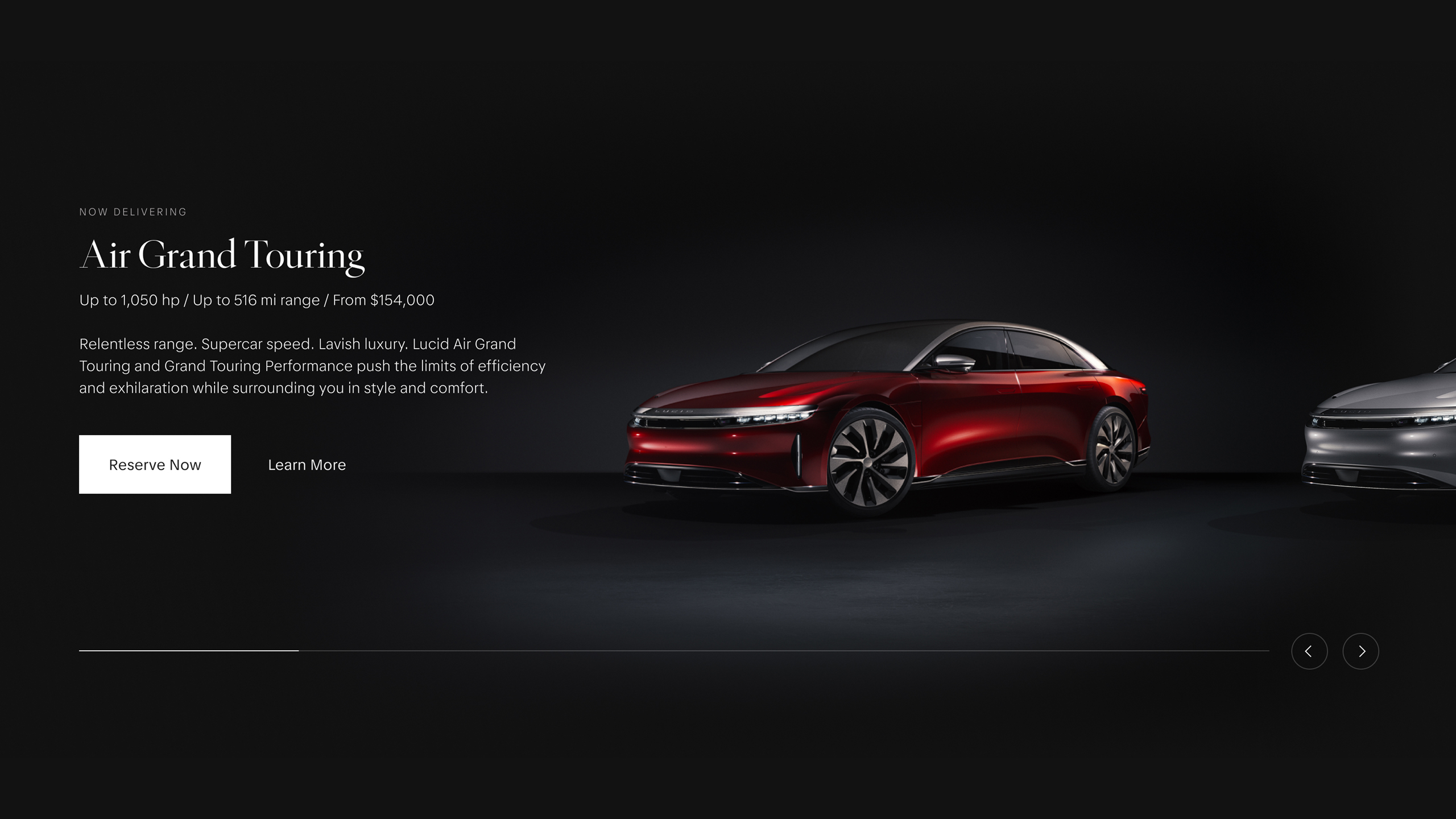
A New Type of Luxury and Performance
Lucid fuses visionary design with technical precision into every aspect of the brand — from the iconic lines of the vehicle to its integrated user interface. With this spirit and a target on performance, we paired beauty and precision down to the finest detail when designing the Lucid type family.
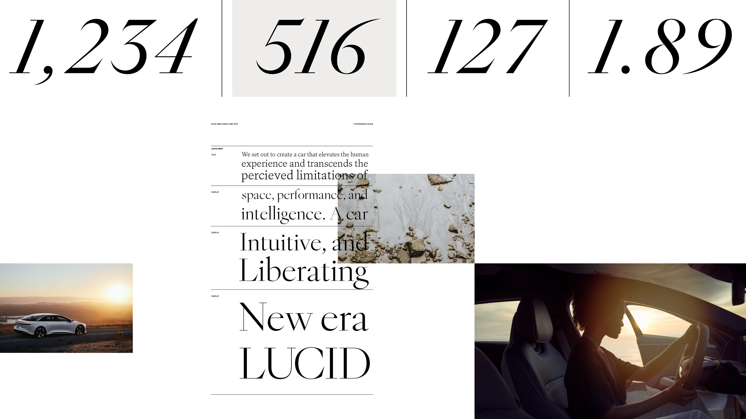
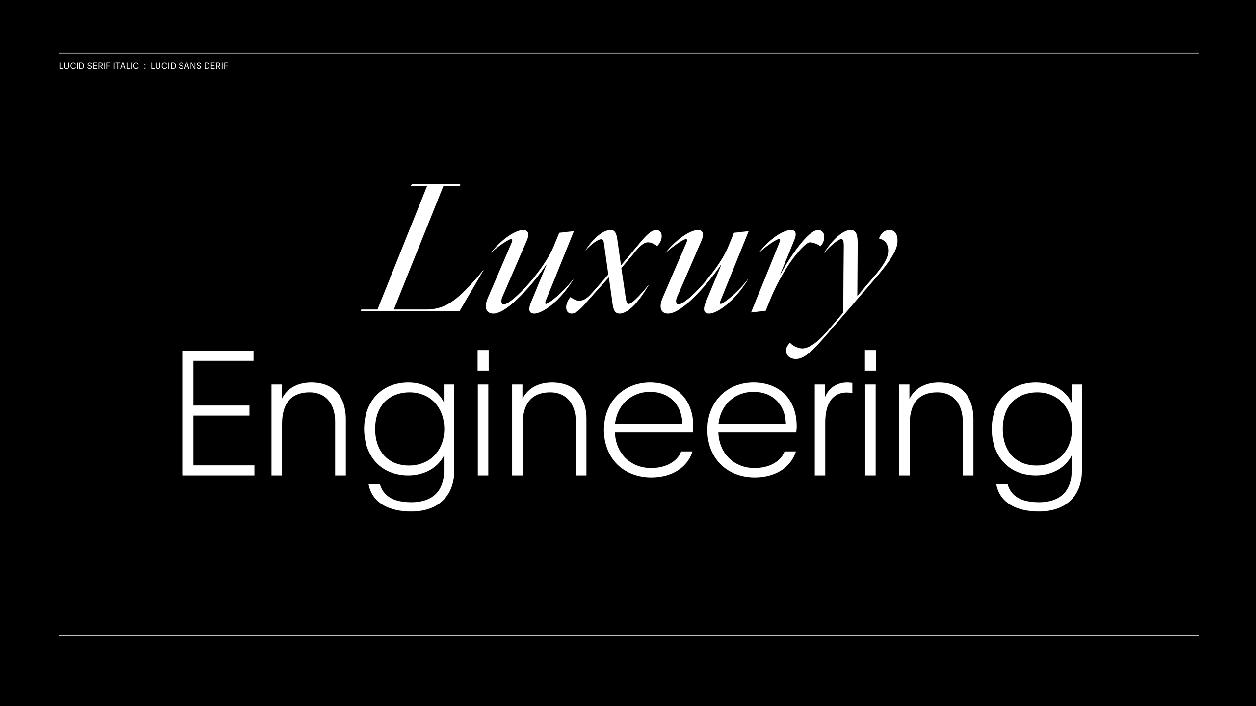
In partnership with Grilli Type and Lucid’s internal brand studio, we developed a signature type system for the brand. This includes Lucid Sans and Lucid Serif: a unified font family that balances functionality and expression across 40 type styles—optimized for both display and text use.
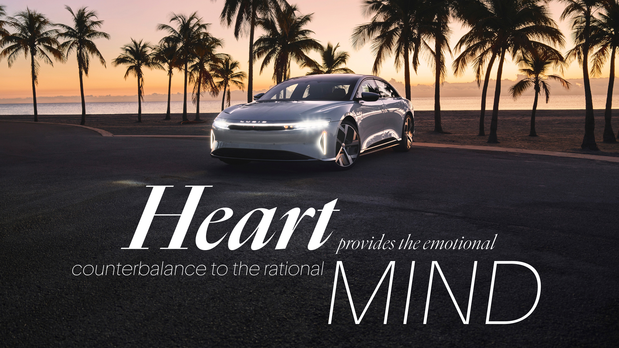
Central to the Lucid brand are two concepts: Heart and Mind. From the emotional to the technical, we developed a serif and sans-serif, each with two optical sizes (display and text), spanning the spectrum of artistic to practical. This gives Lucid a truly proprietary voice in its typography.
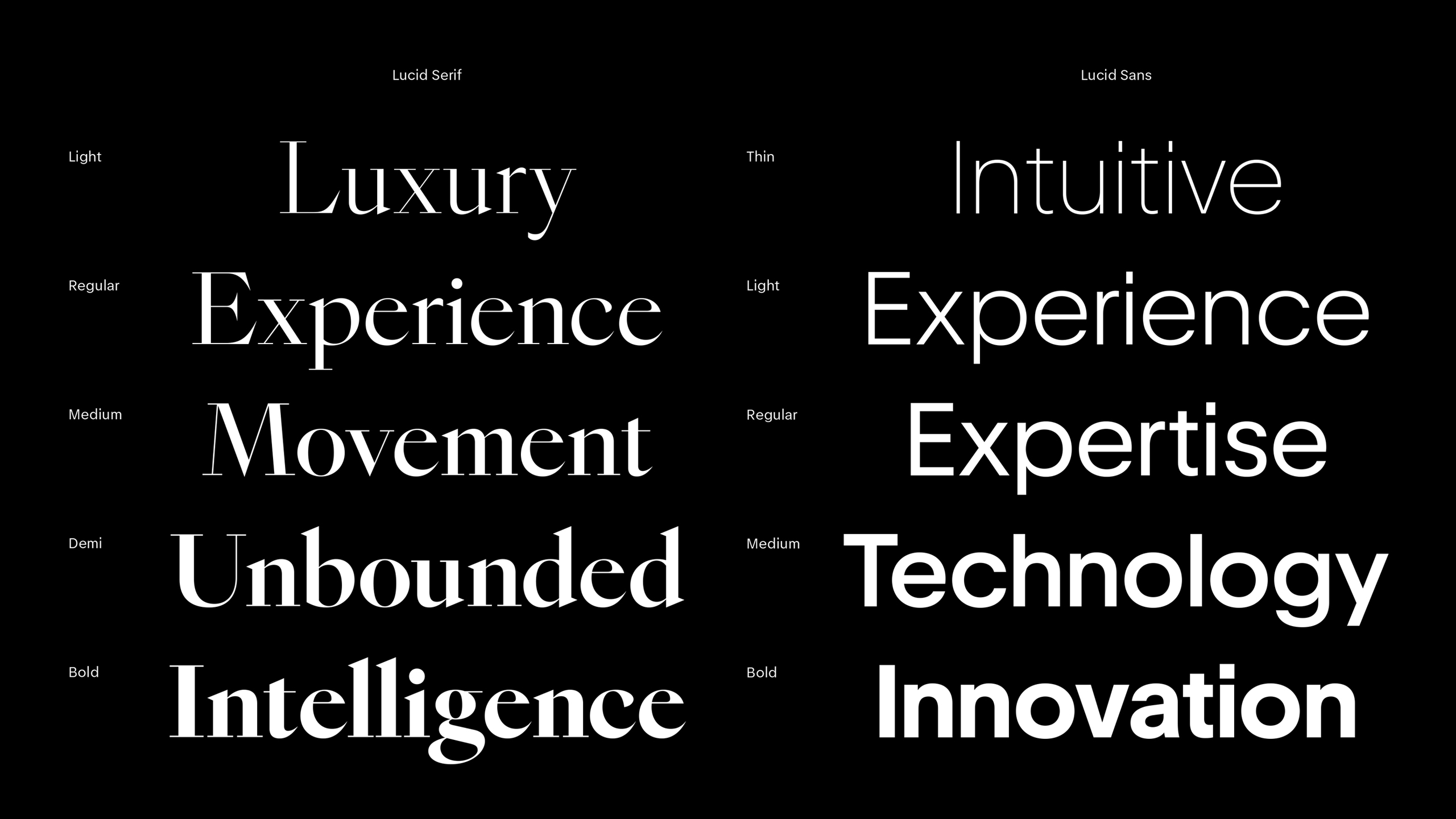
Addressing every interaction across the Lucid brand experience, we developed each typeface as a Variable Font (VF) with three axes: Weight, Optical Size, and Slant. This provides ultimate flexibility and control over each characteristic of the typeface.
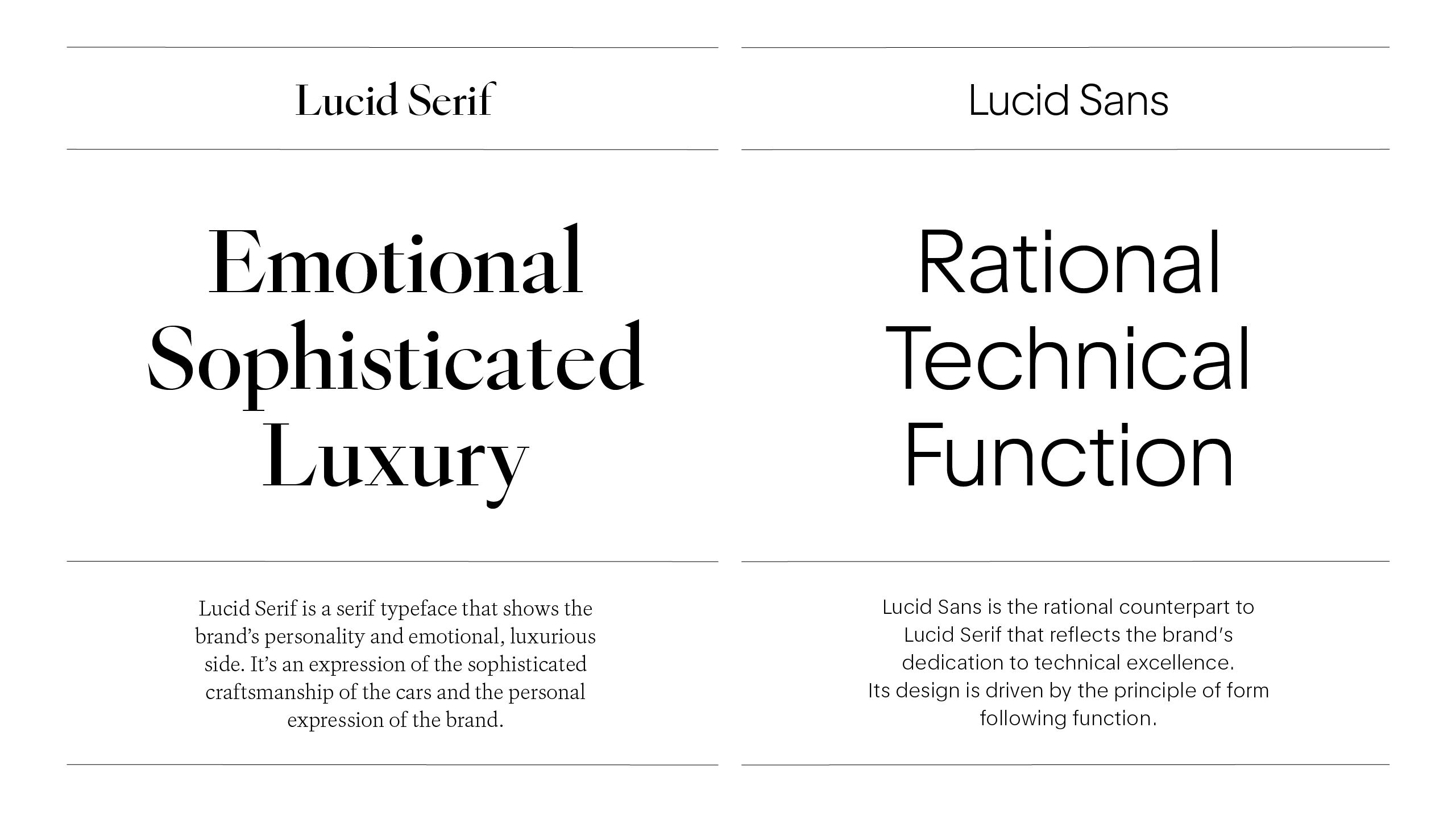
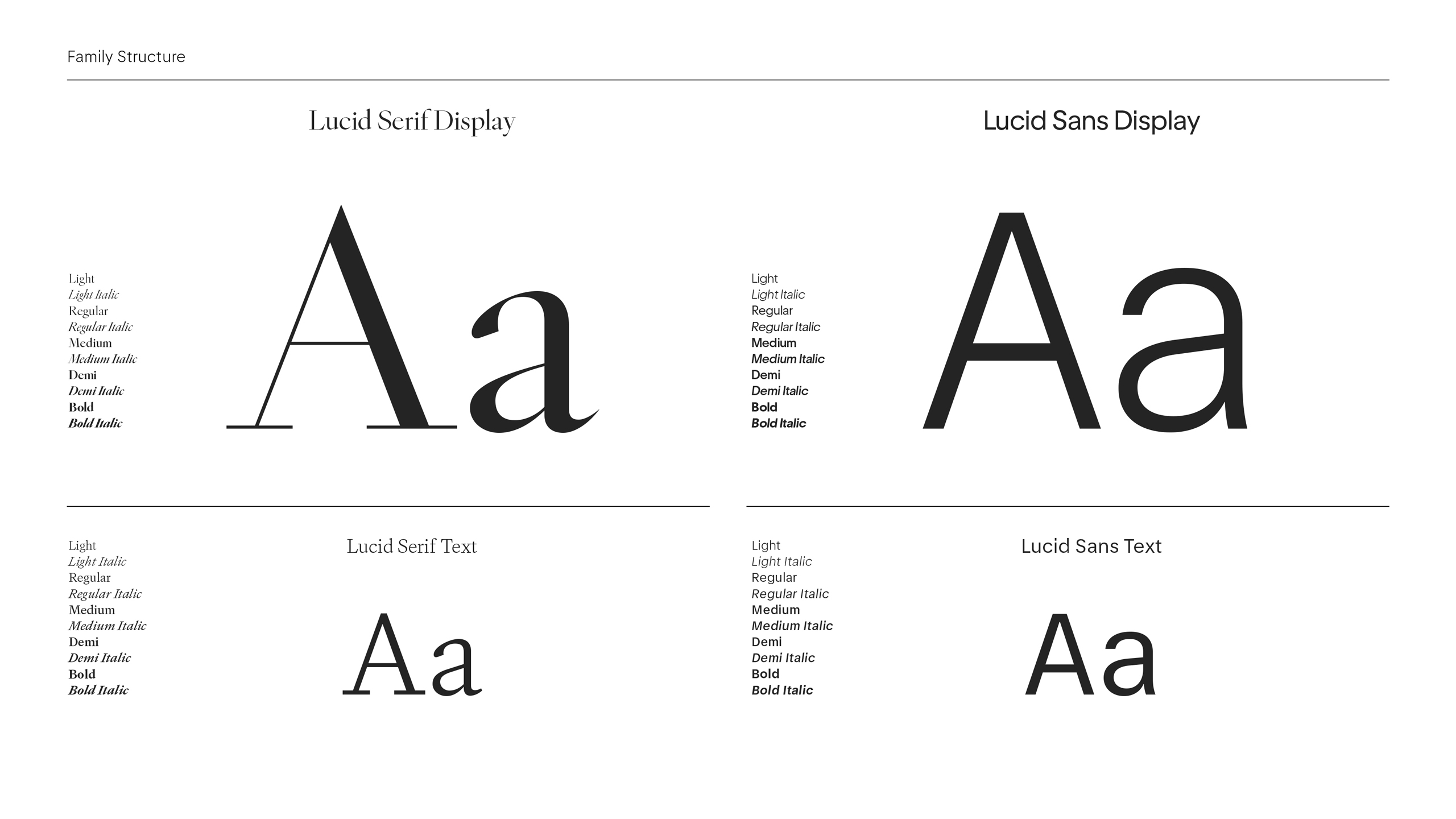
The Display and Text styles enable both typefaces to flex between expressive and functional purposes. Lucid Sans Text extends the unique ability to transition from a geometric sans-serif in the Display style to a grotesque in the Text style, optimizing for space and legibility.
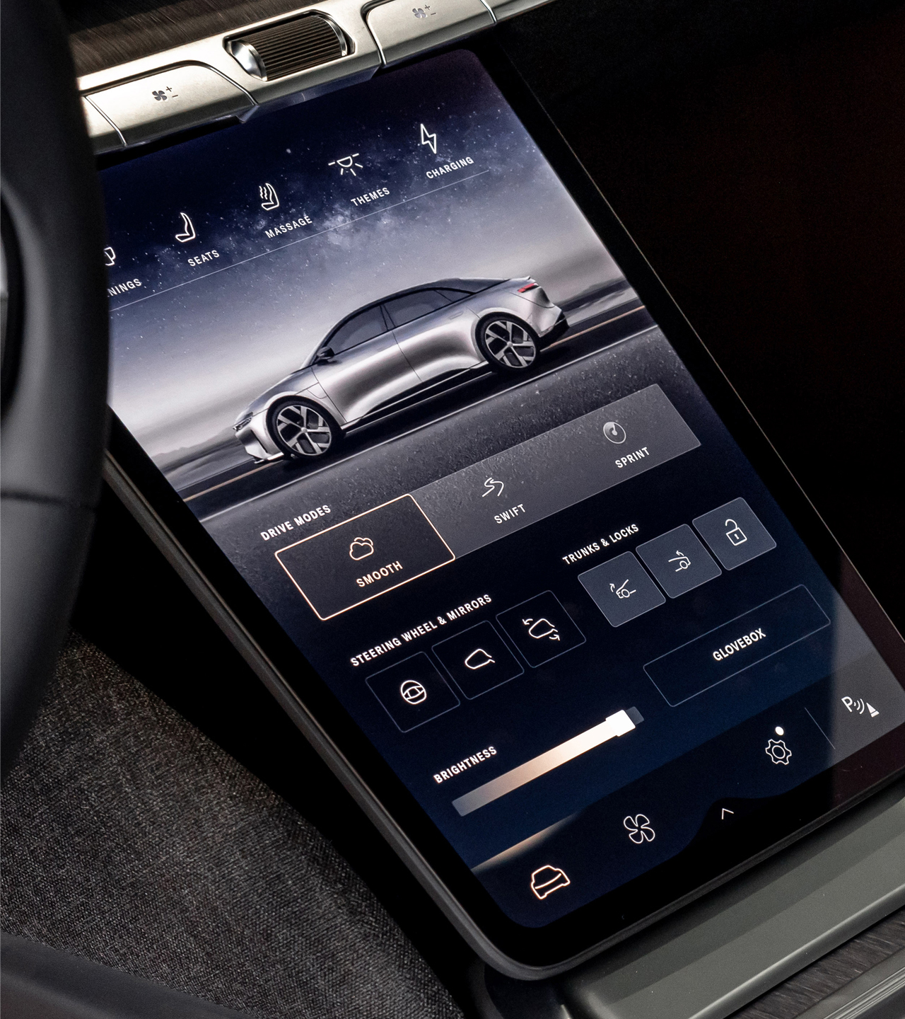
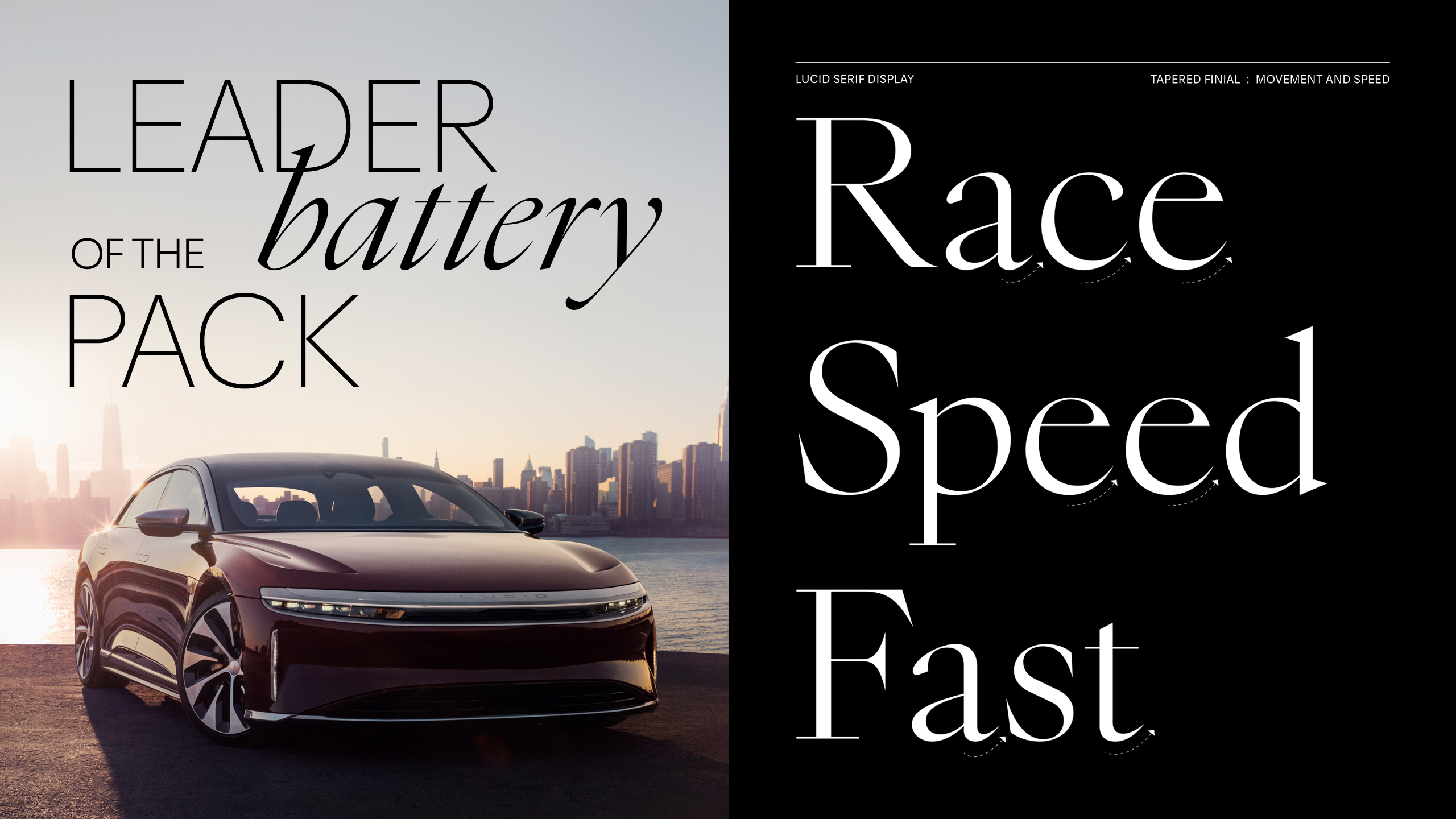
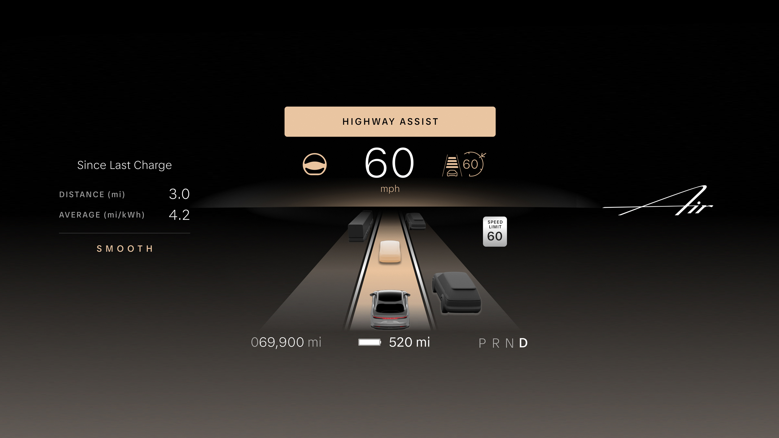
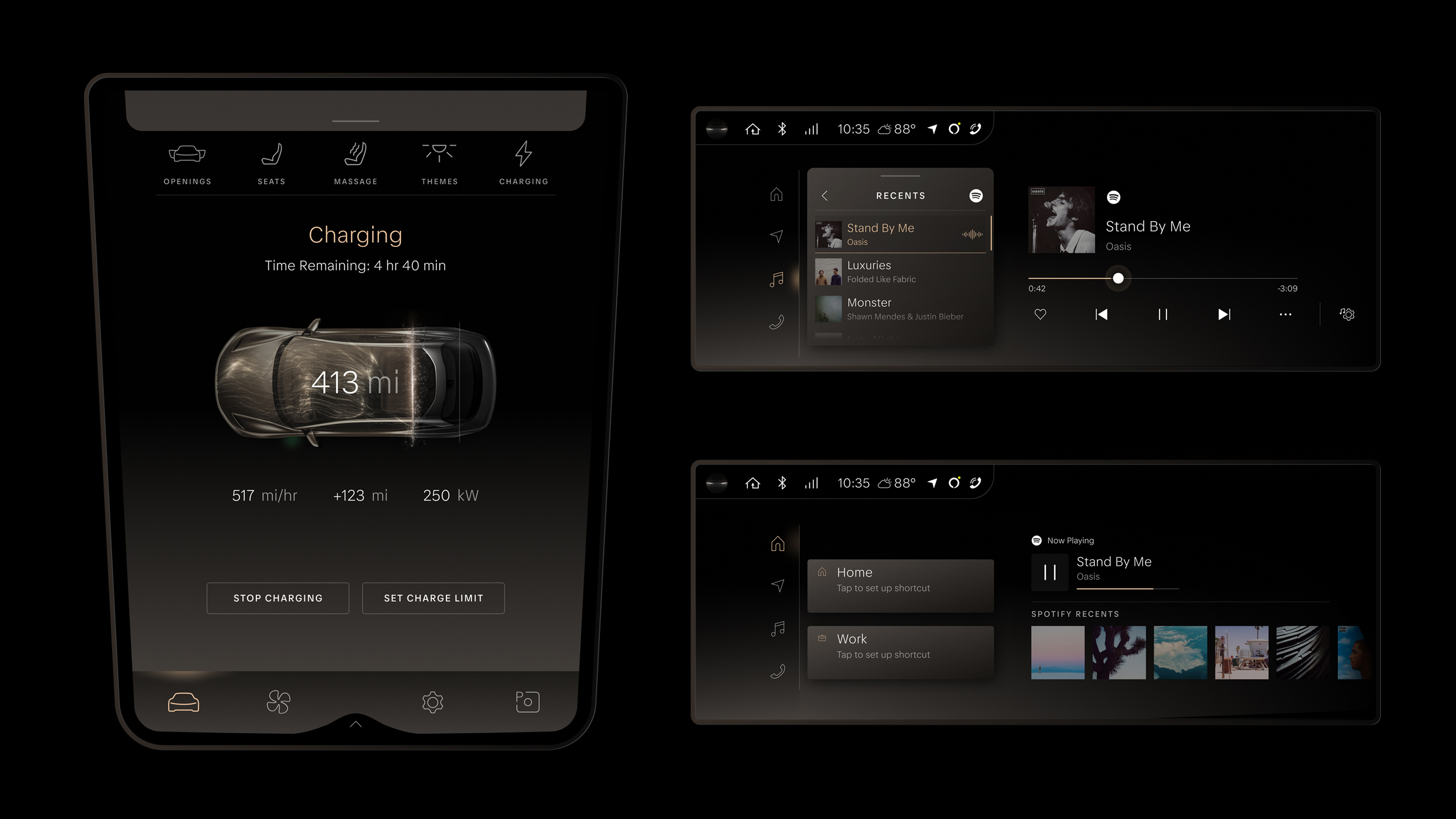
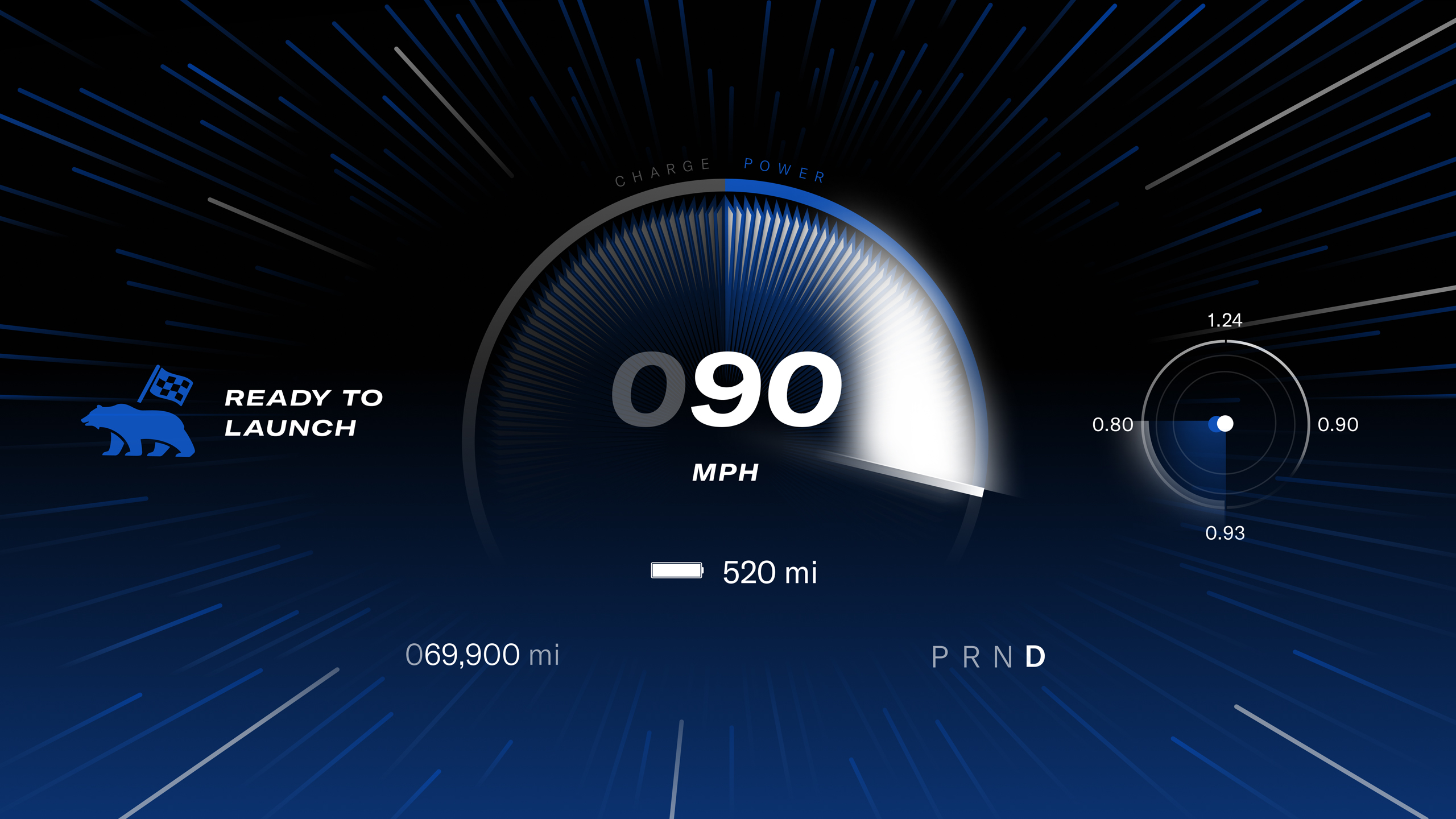
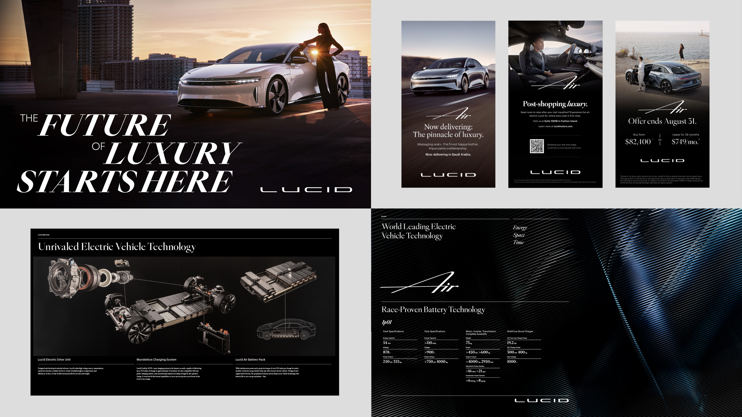
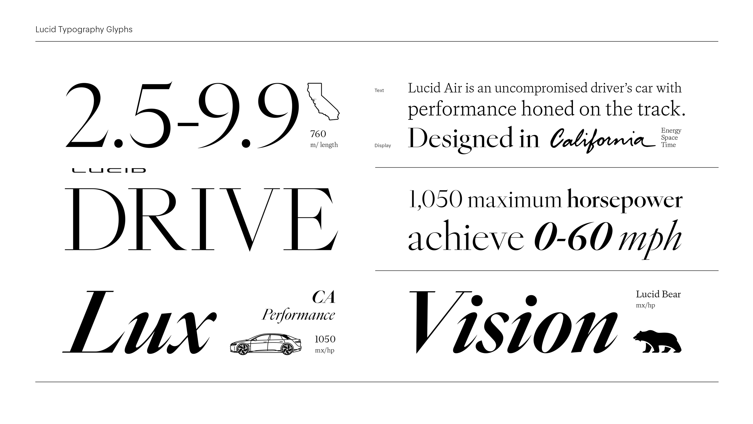
Designed to scale and perform across every application, Lucid’s type system connects all experiences while meeting each moment’s expressive and functional needs. Whether it’s a social media ad, a 50-foot billboard, or ensuring legibility at high speeds in the vehicle display, the core philosophy of Heart and Mind shines through.