More Than a Cosmetic Change
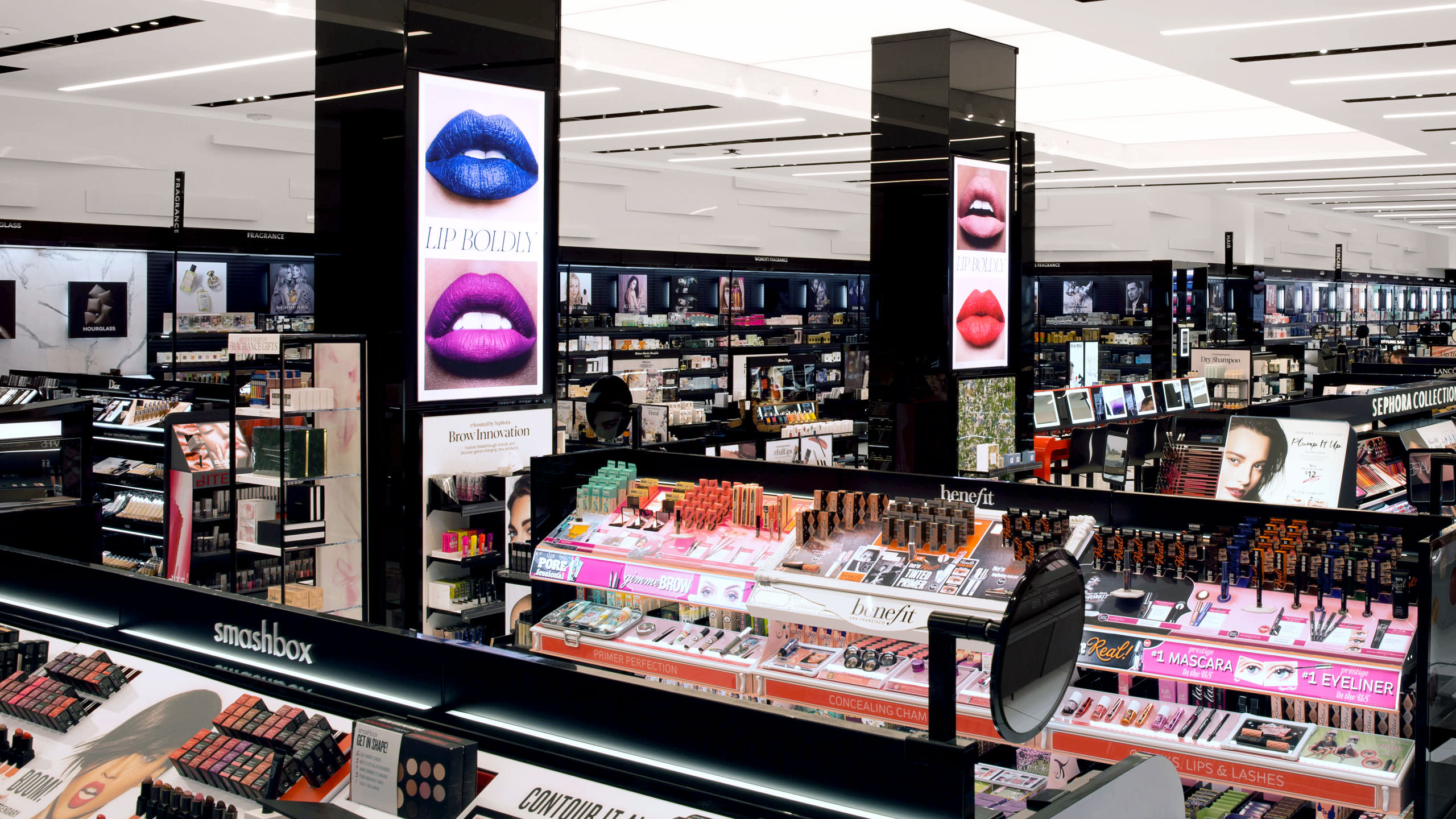
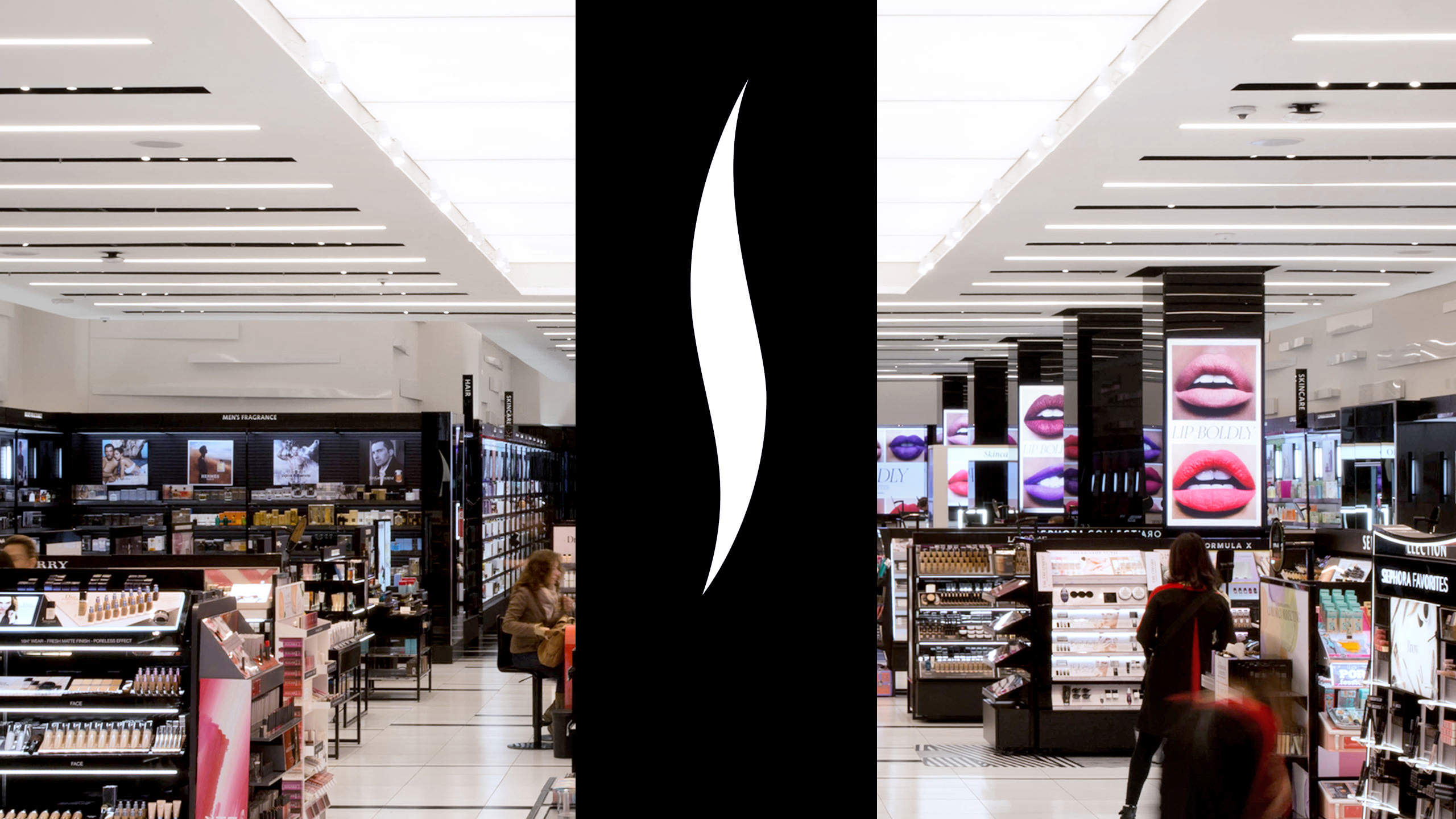
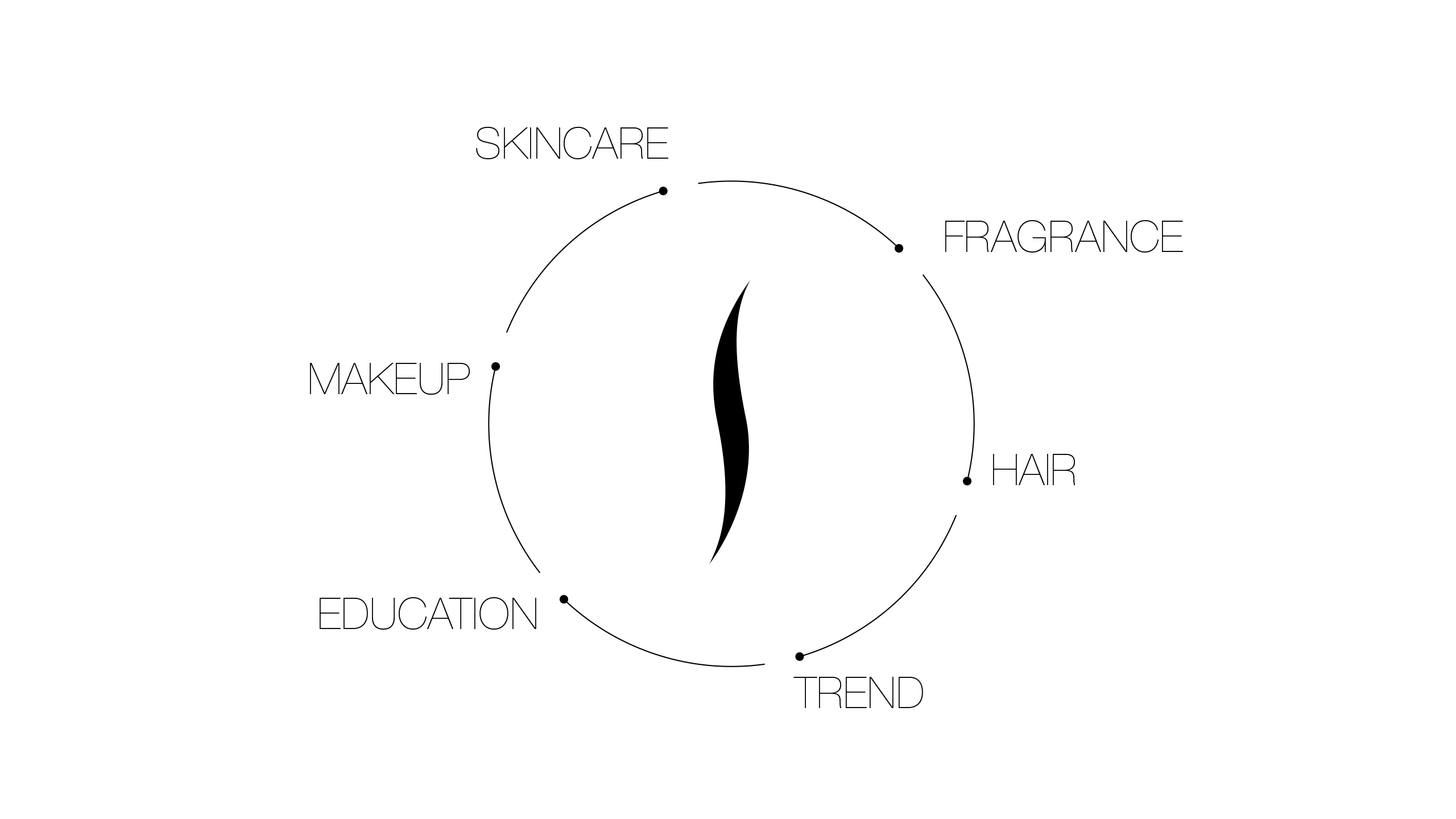
Four years after helping build a foundation for their retail brand expression, Sephora wanted to redesign the way customers navigate and experience their stores. The system was implemented in two Stores of the Future, intended to serve as models for all upcoming Sephora locations.
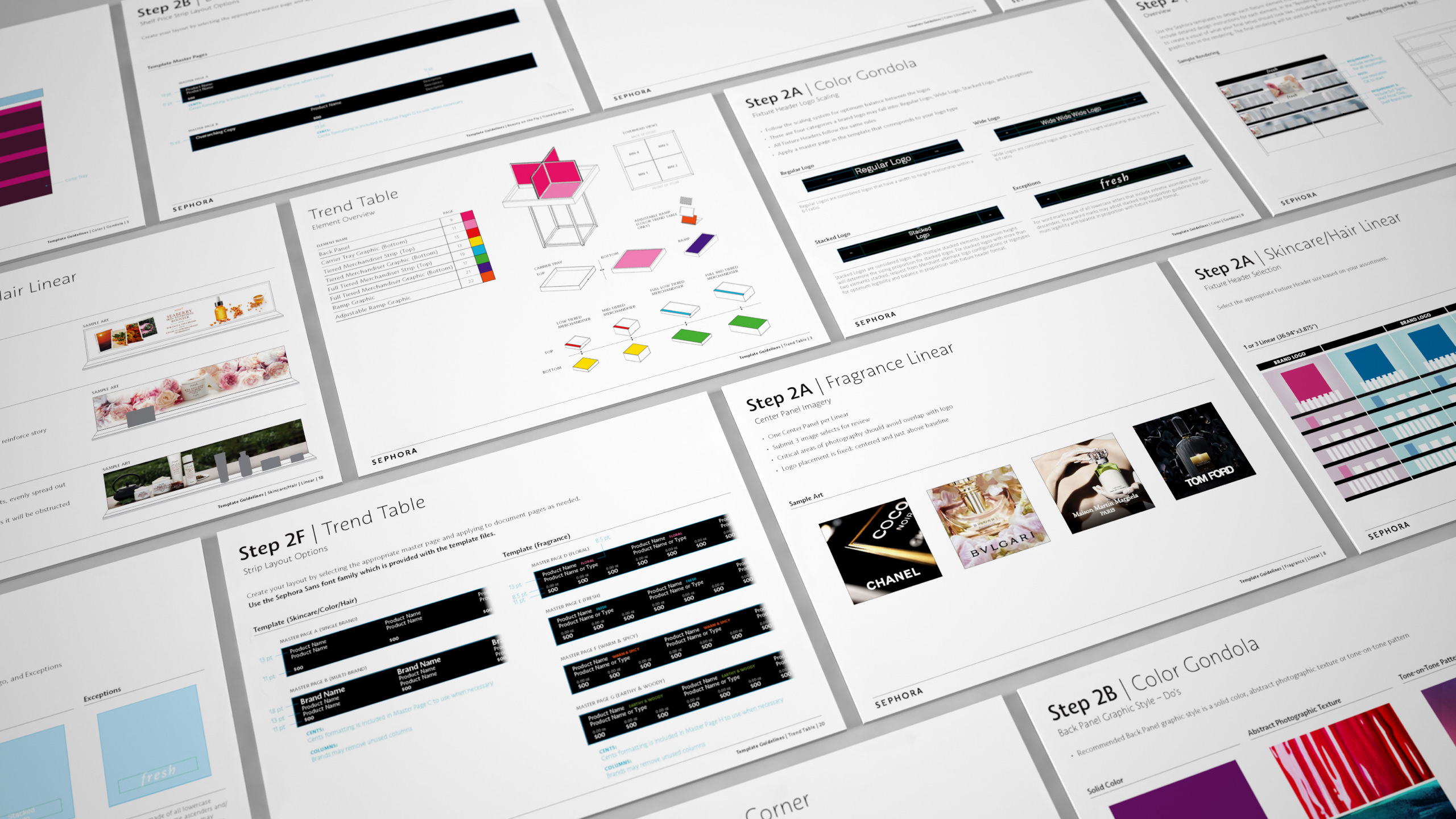
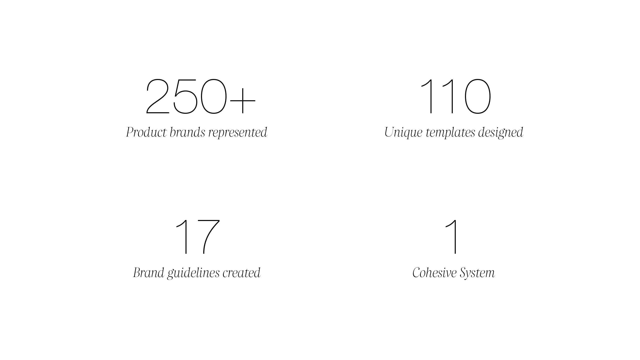
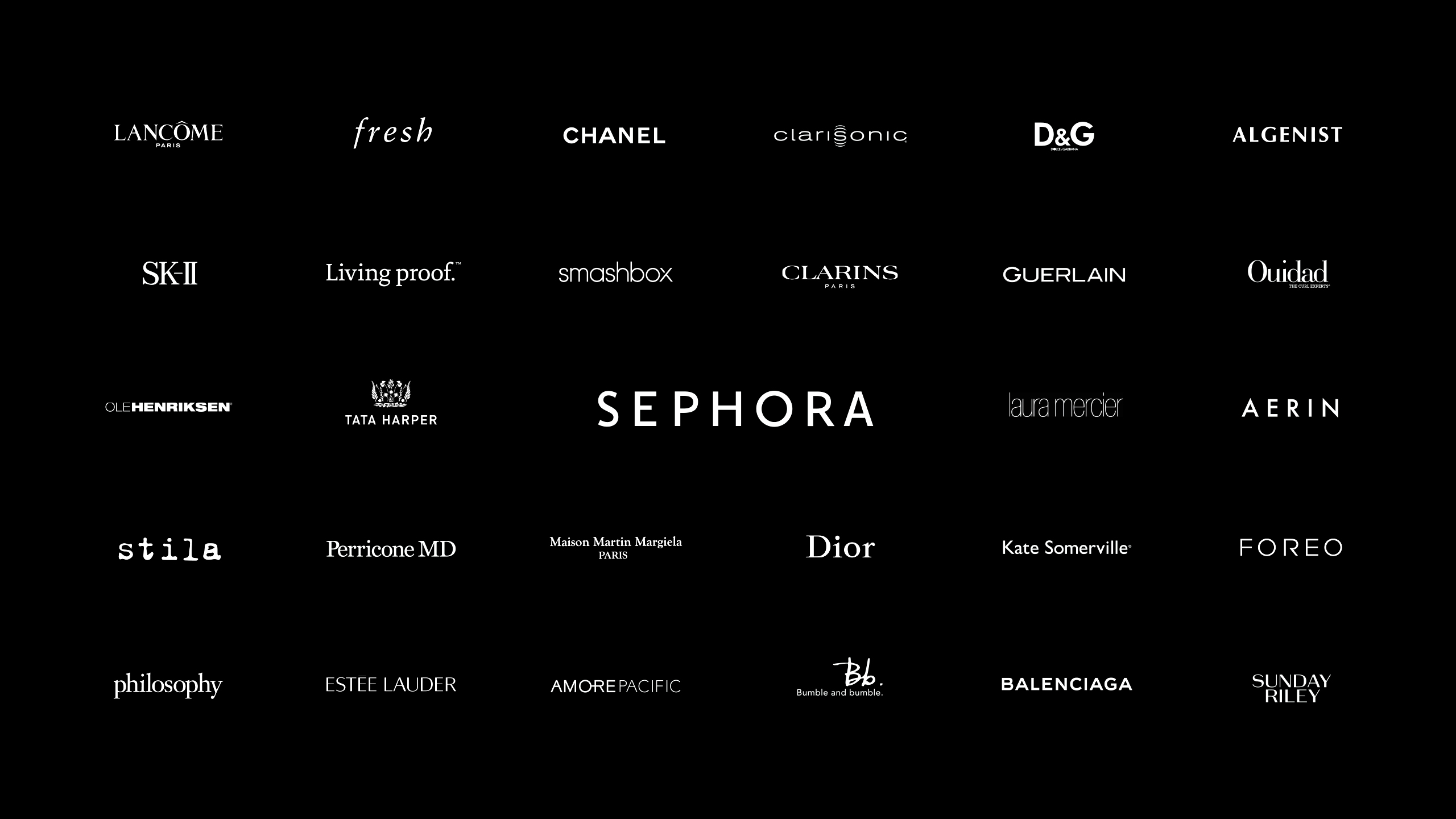
Key to the initiative was a newly designed signage system, which required templates for every sign type and guidelines for all brands found in Sephora stores.
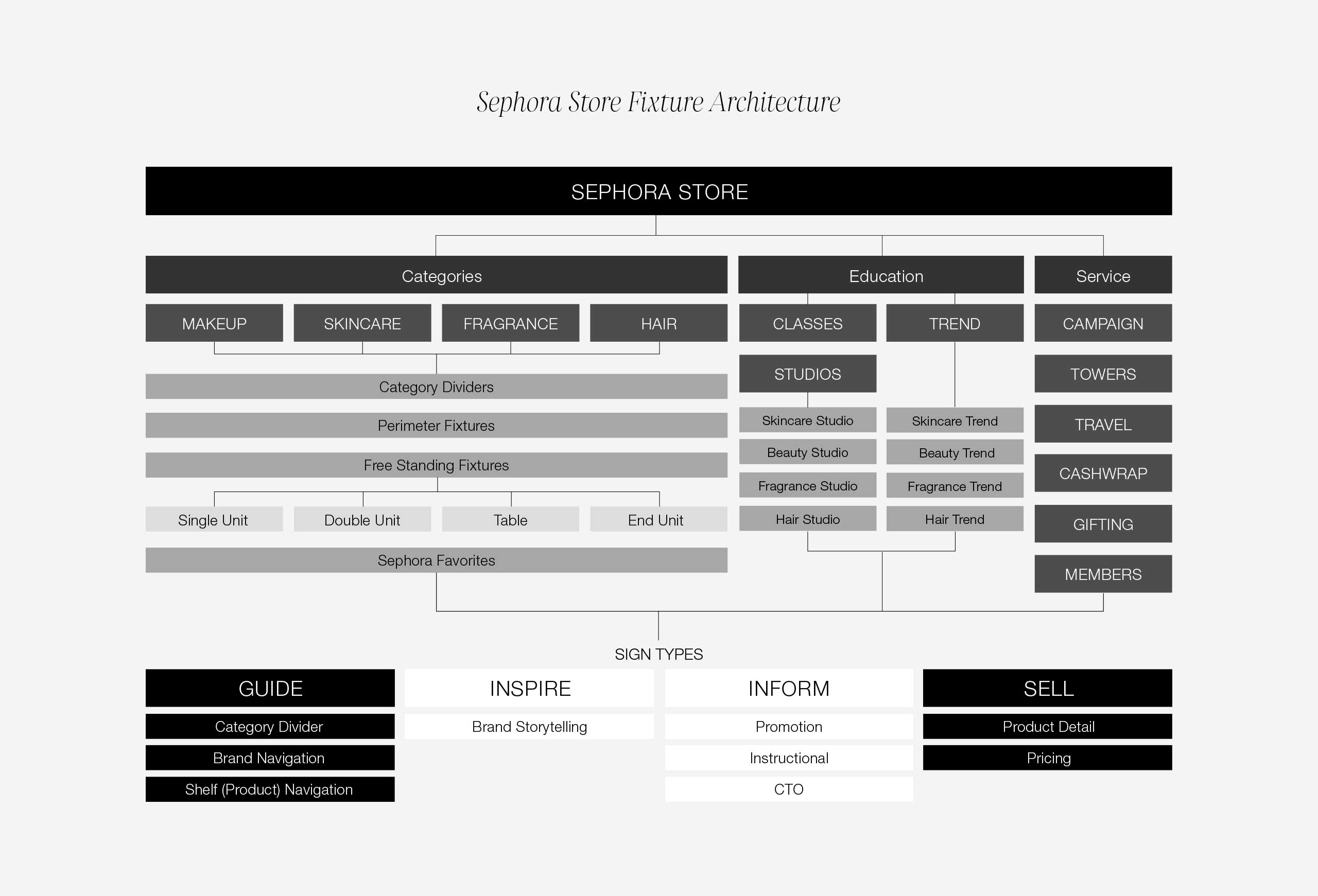
The ultimate goal was to employ a signage architecture with optimal legibility and enough flexibility to accommodate the constant ebb and flow of retail products.
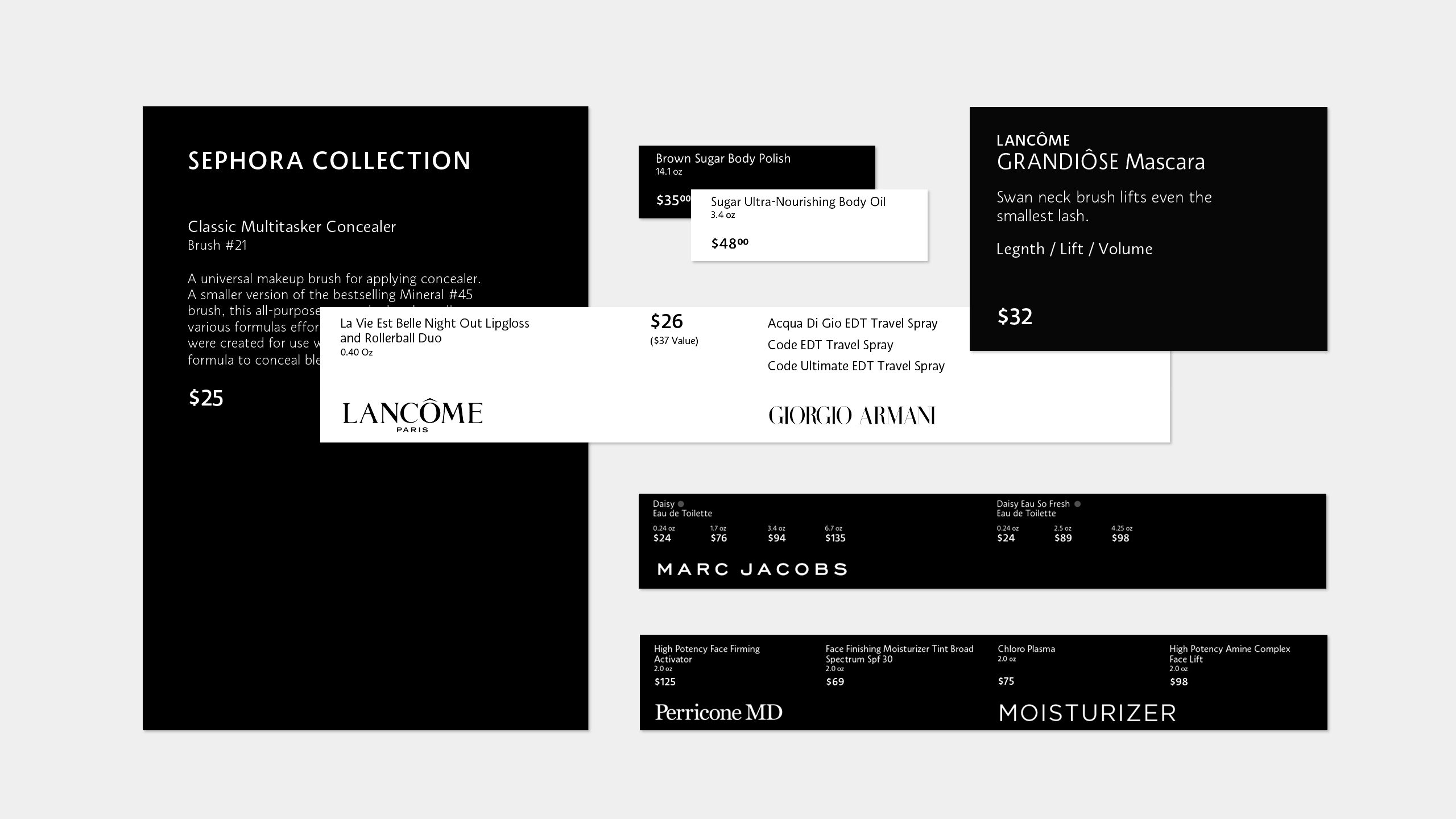
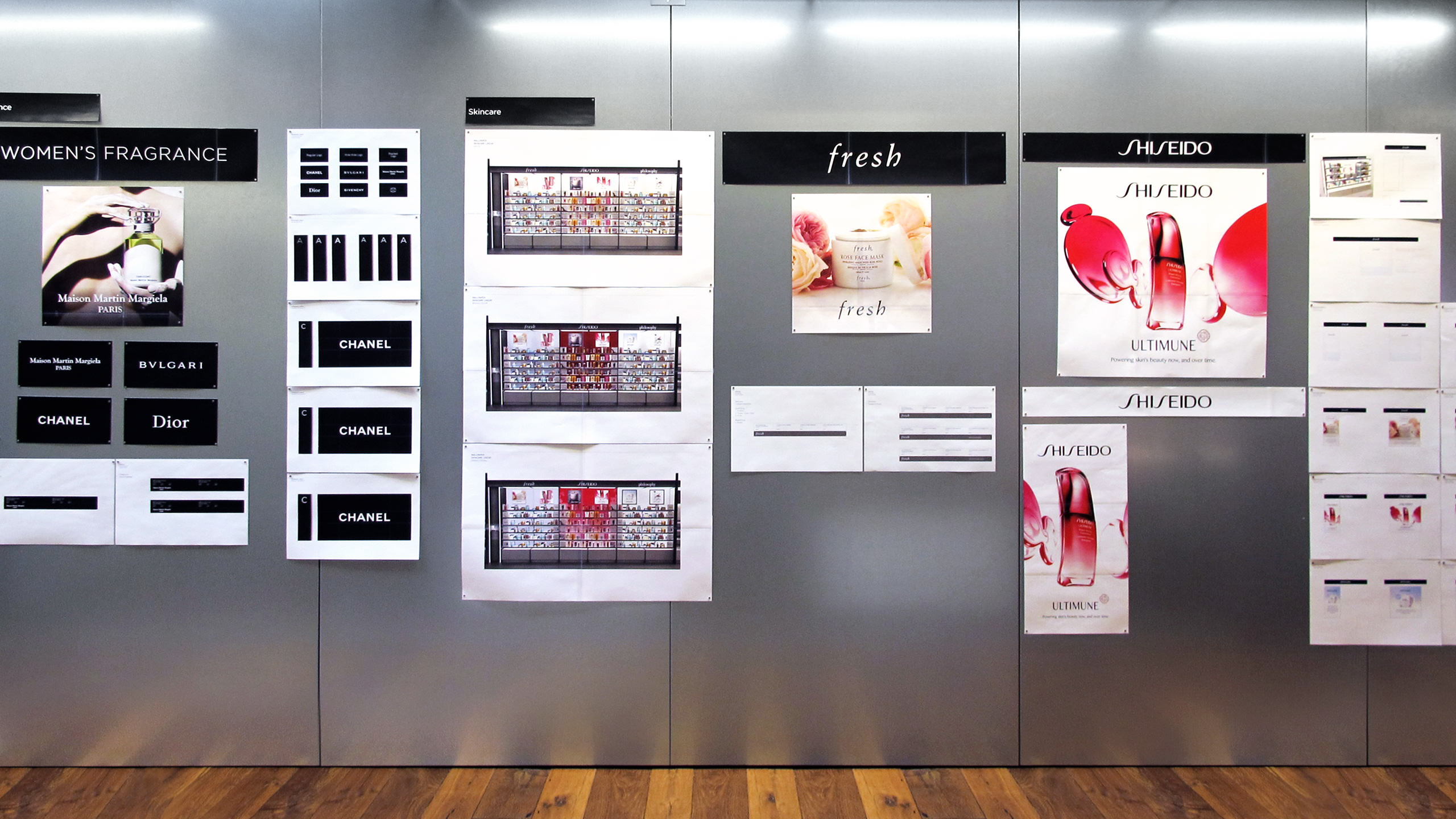
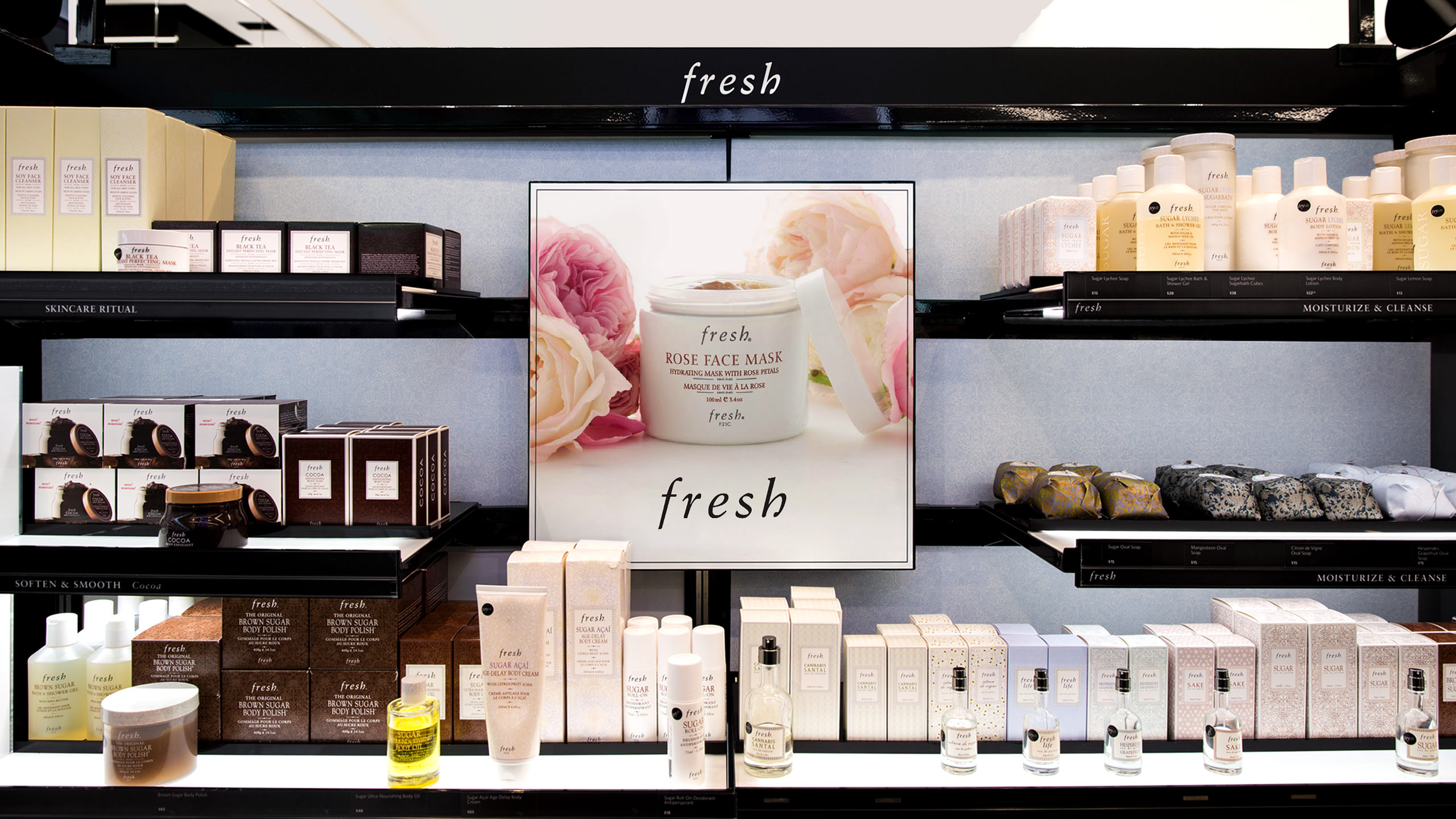
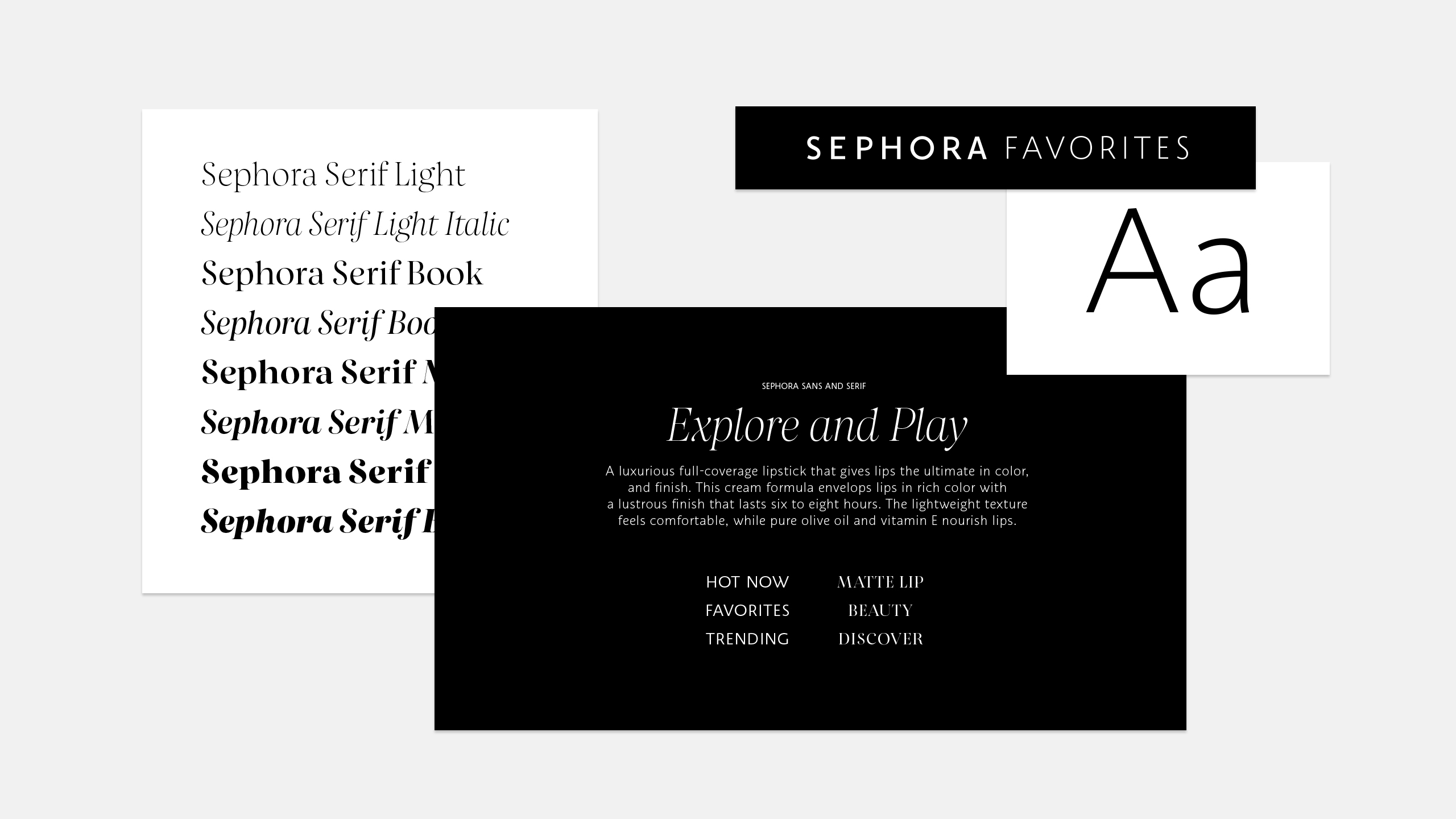
To help brands market their products and customers navigate throughout the store, a series of templates and guidelines were developed with elaborate hierarchies governing type, logo, and content.
