

Clients often look to us as their think tank. They’ll ask us to test an idea, validate a decision, or solve a problem. But unlike a typical branding project, clients are motivated more by understanding the possibilities than landing on a concrete outcome. It gives them a way to evaluate a business opportunity before fully committing their brand, market strategy, and bottom line to the cause.
NUDE Skincare, an LVMH brand, sought to understand how a new positioning strategy developed in-house could affect their visual expression. In the fiercely competitive skincare market, quality is table stakes. It’s the packaging and point-of-sale systems that carry the burden of capturing the customer’s attention and conveying the product’s differentiated value. Even the best products live and die by what the design communicates, which is why Nude wanted to visualize the possibilities to validate their strategy.
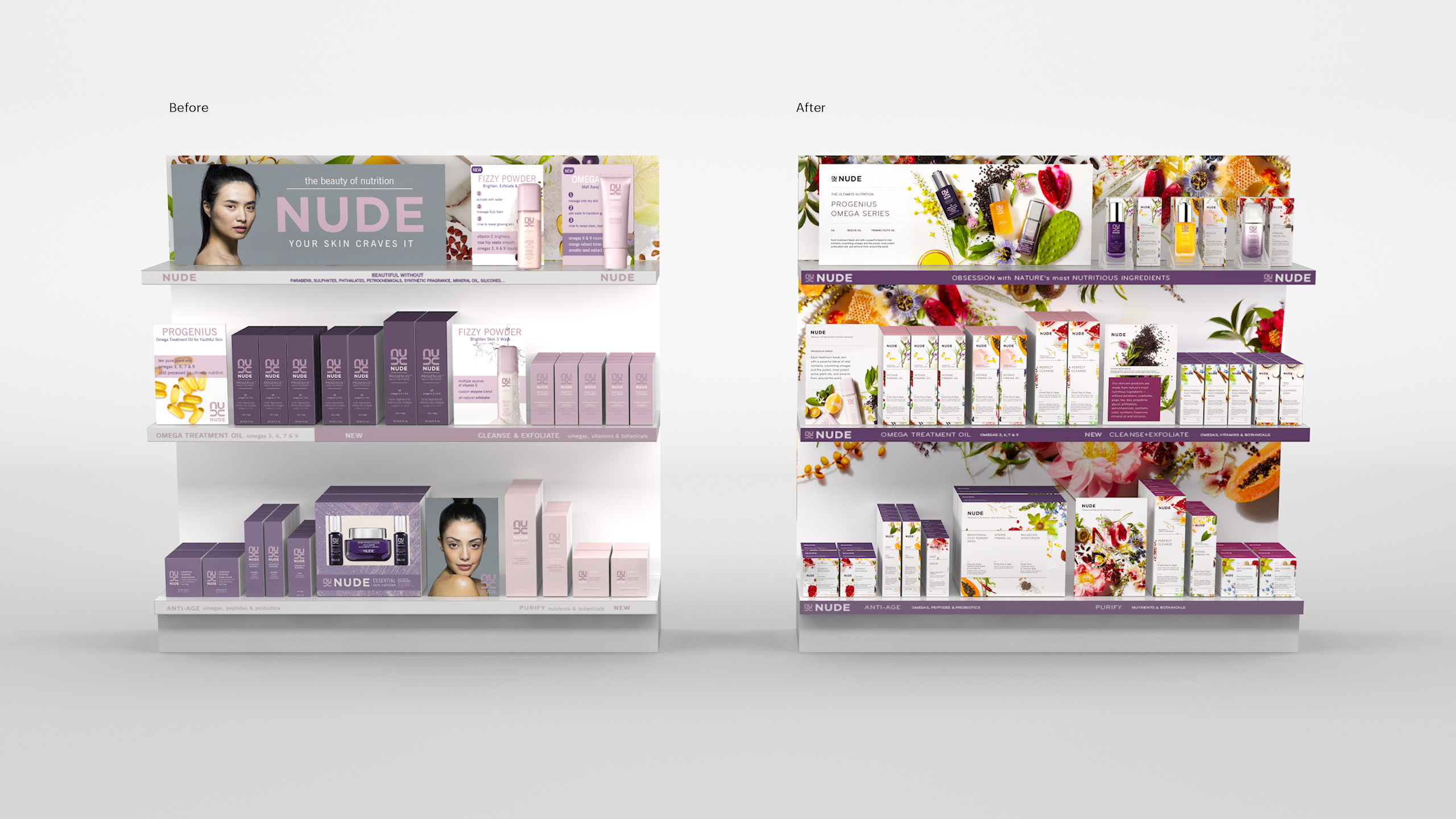
When NUDE first hit the market, they leaned heavily on their identity, the color purple, and “nude” model photography to build brand recognition. But because the traditional beauty and skin care fields are highly competitive, NUDE needed a further point of differentiation. Fortunately, they had one: a product made with the highest quality, all-natural ingredients curated from around the world.
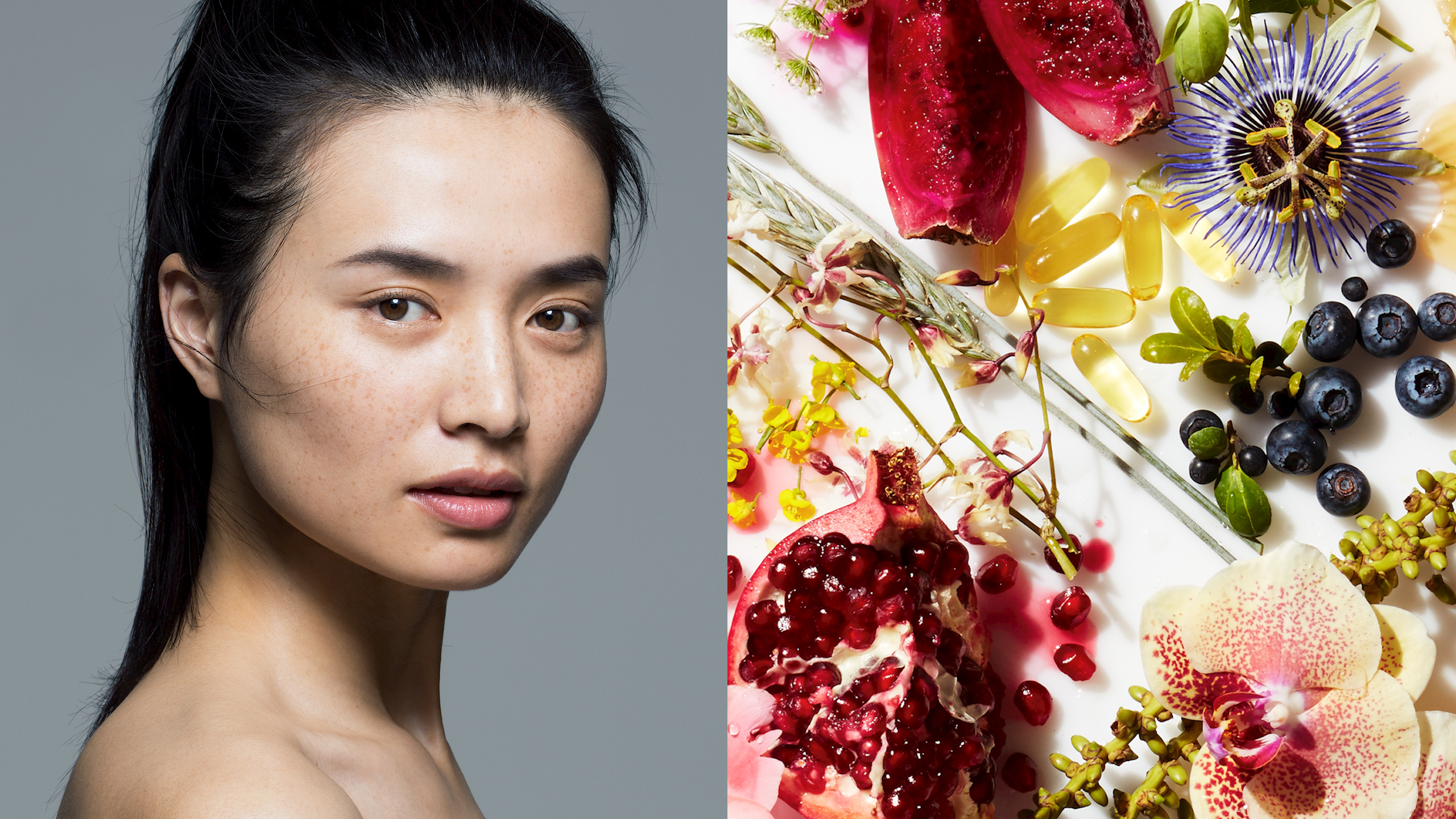
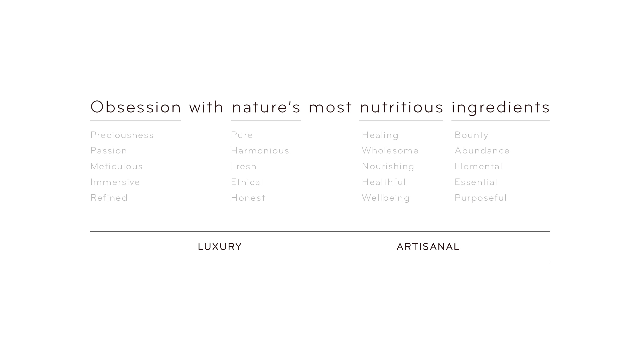
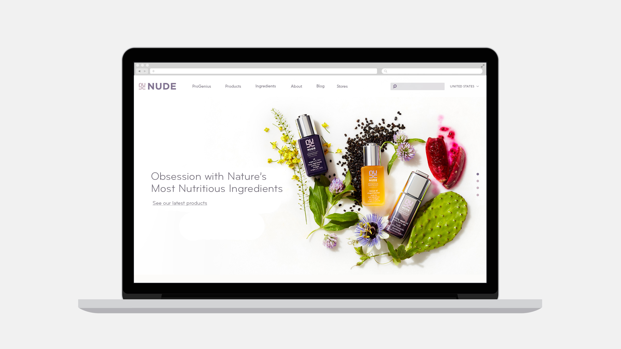
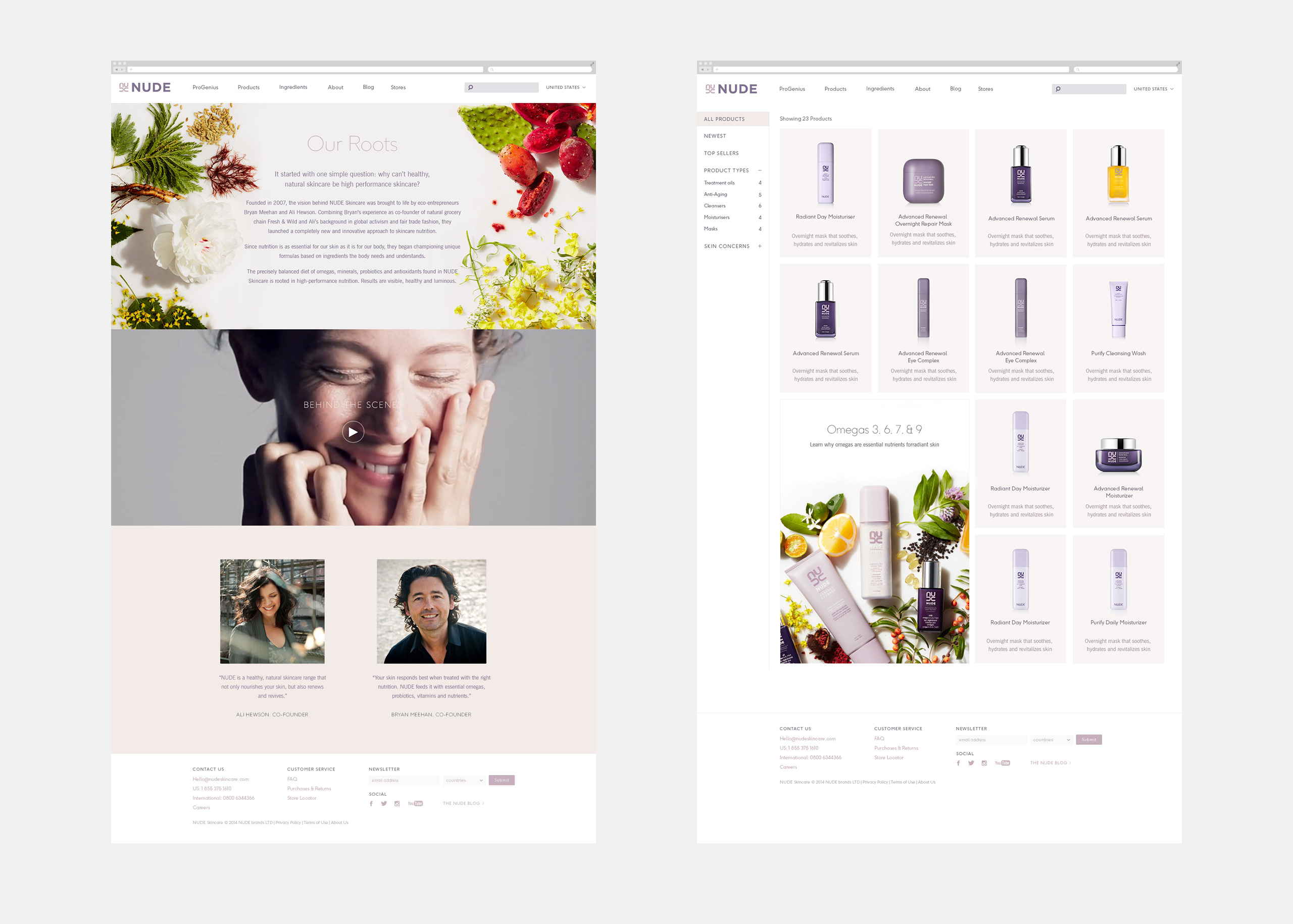
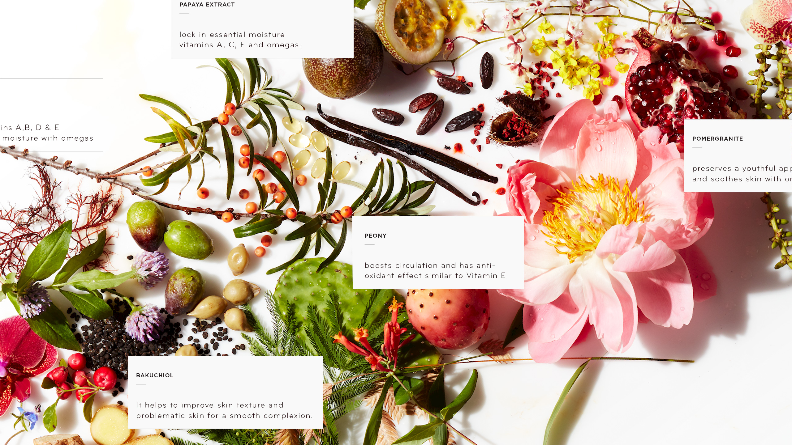
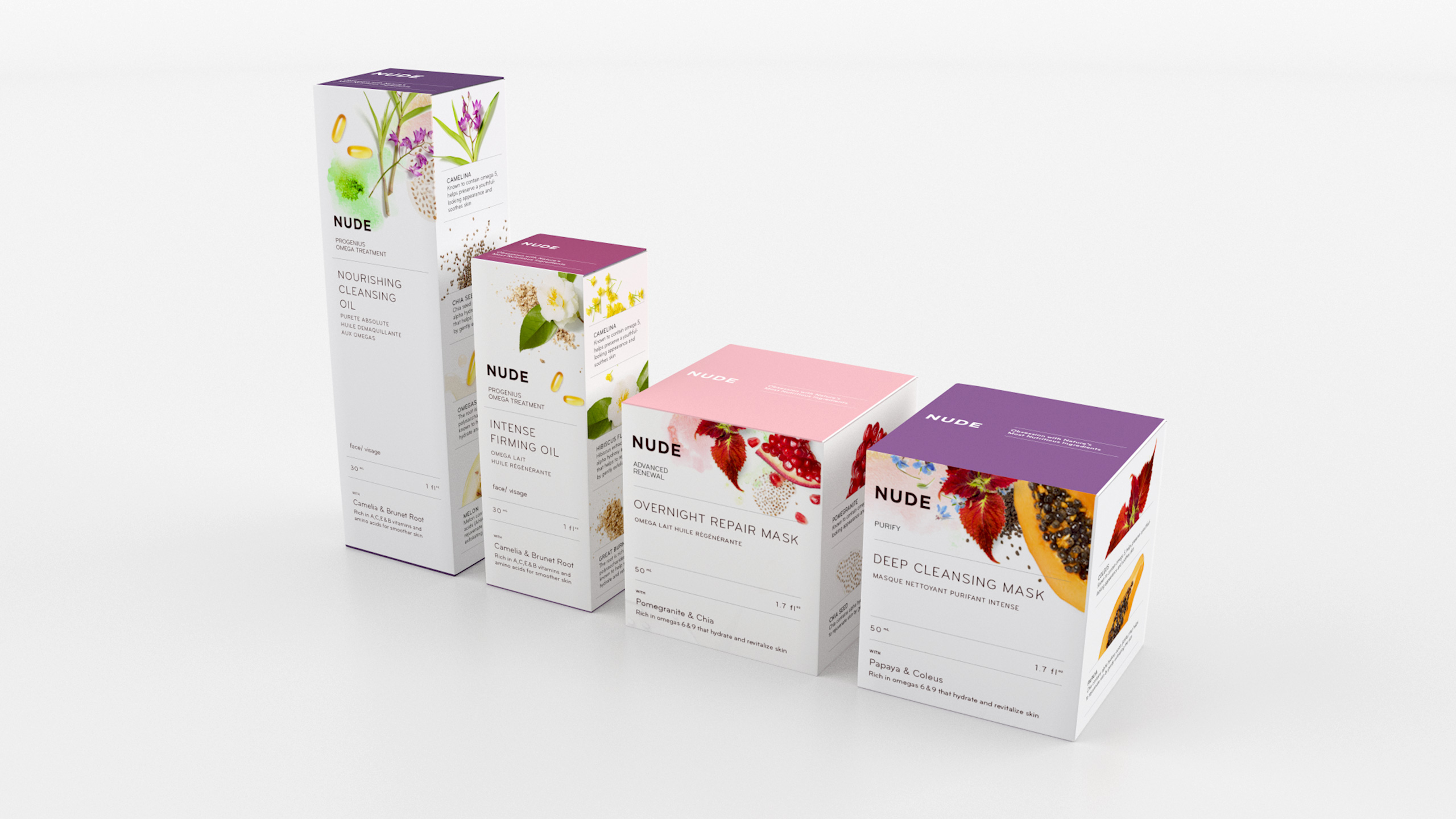
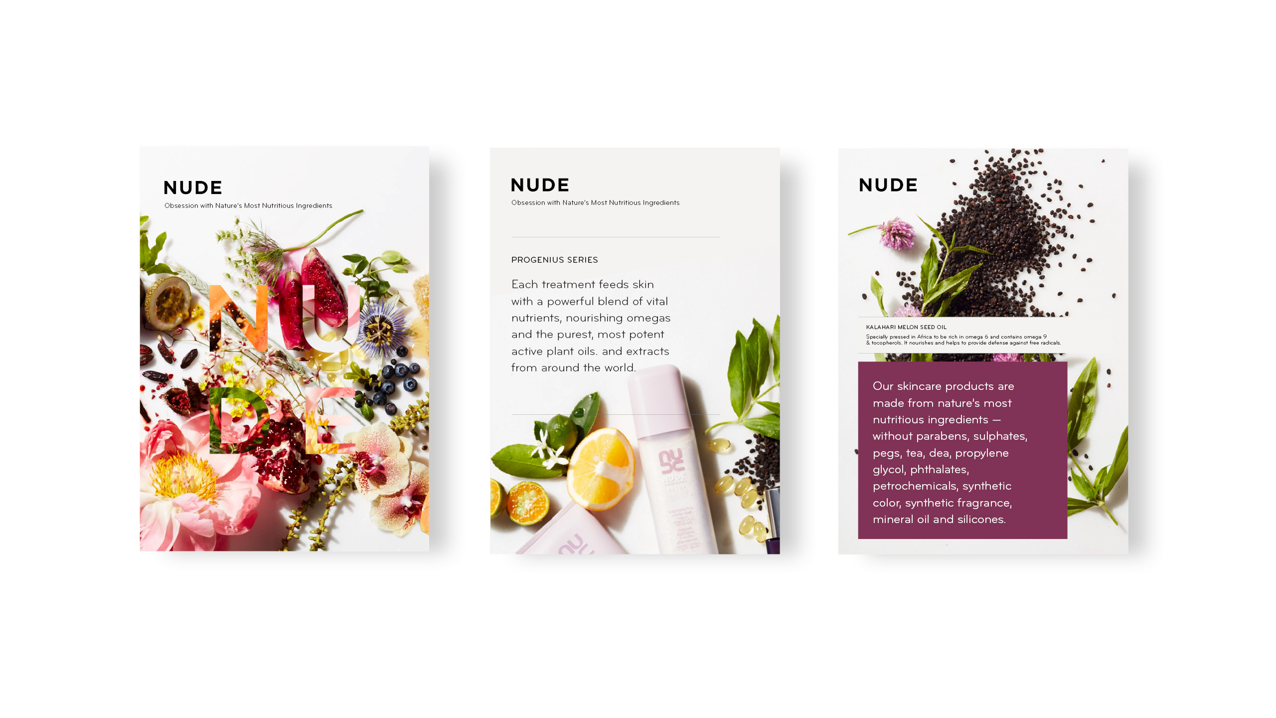
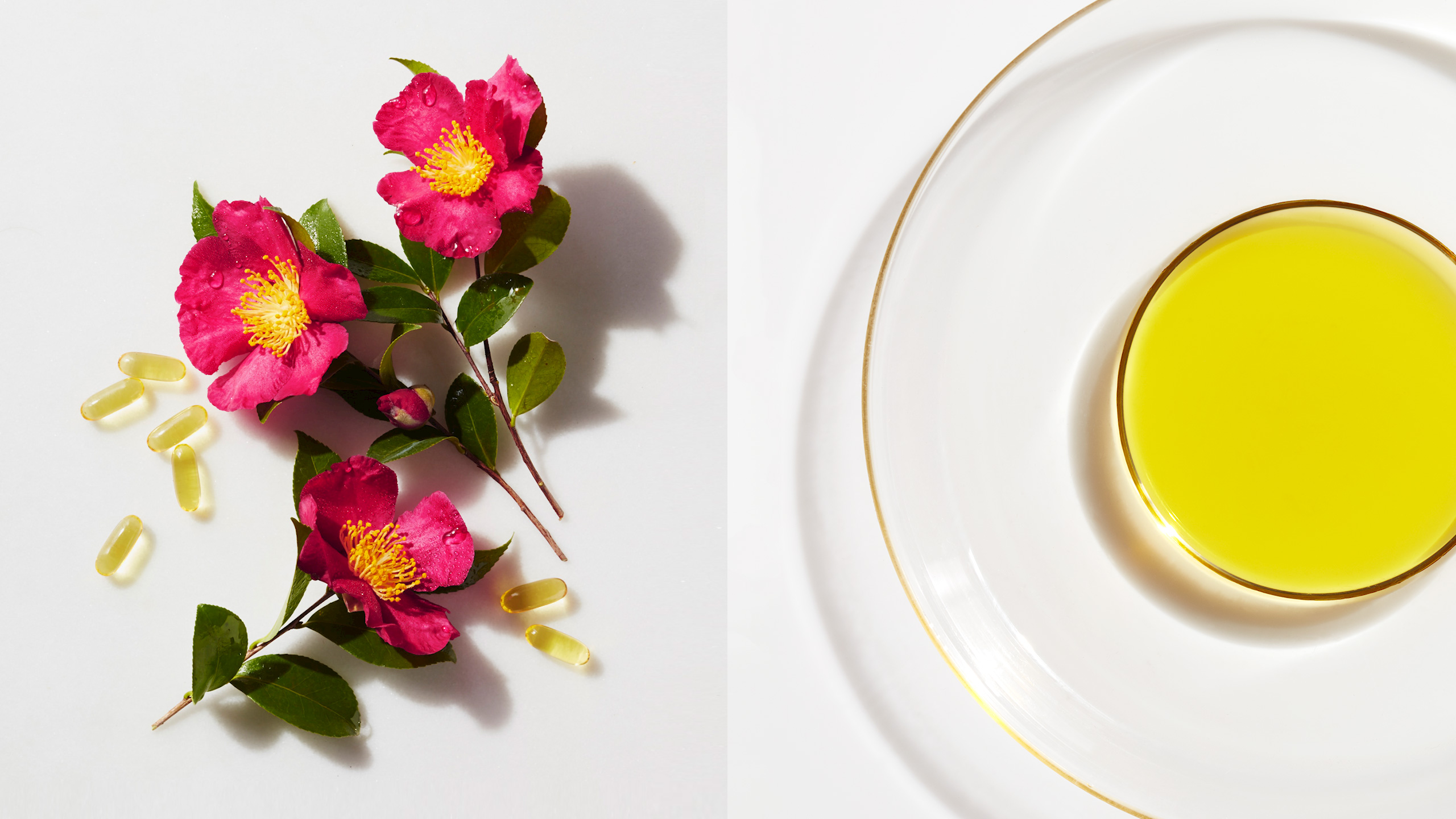
NUDE decided to pivot, realigning their brand with the core of what makes their products exceptional – “an obsession with nature’s most nutritious ingredients” – and tasked us with showing them how their new positioning could be expressed visually. Through an extensive study, we narrowed in on a photographic approach that celebrated the ingredients and highlighted their natural beauty through color and composition. Paired with a refreshed typeface, a simplified wordmark, and new graphic expressions, we showed them how we could extend the system to packaging, POS, print, and web applications, all while honoring the brand’s established form factors and color equity.
