A SaaS-y New Identity System
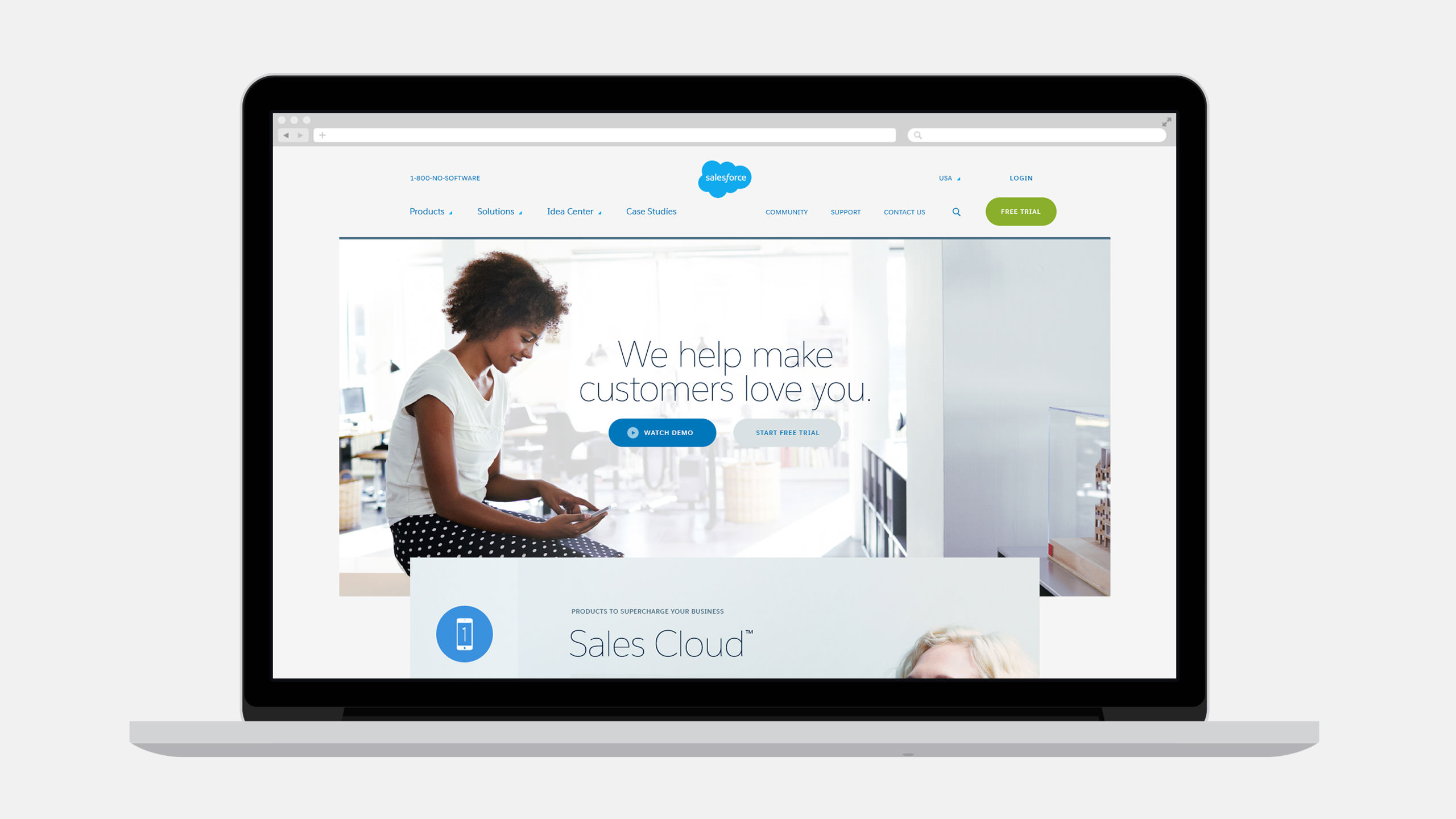
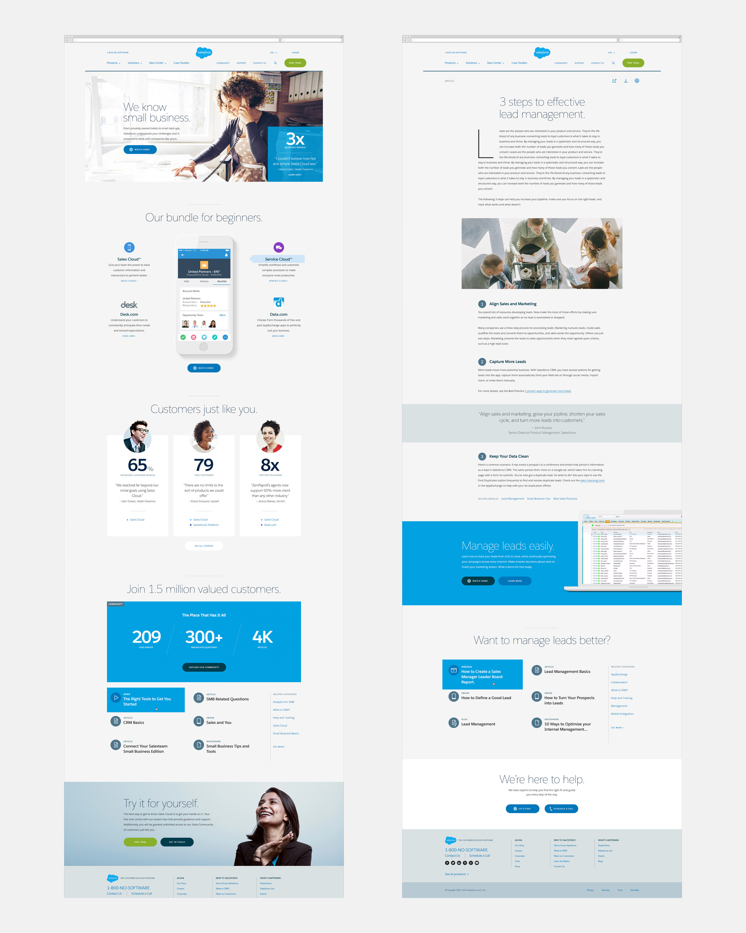
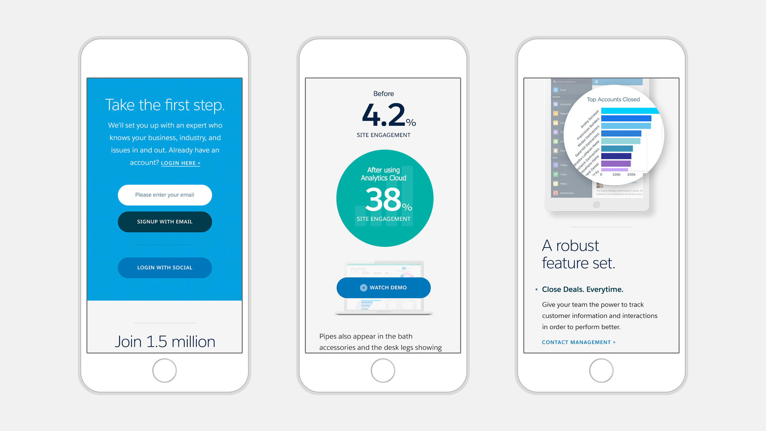
Salesforce advanced cloud computing with its software-as-a-service (SaaS) model. Now with a platform spanning multiple products, Salesforce required a comprehensive identity system with a modernized logo, a simplified brand architecture and a new, more expressive typeface and color palette.
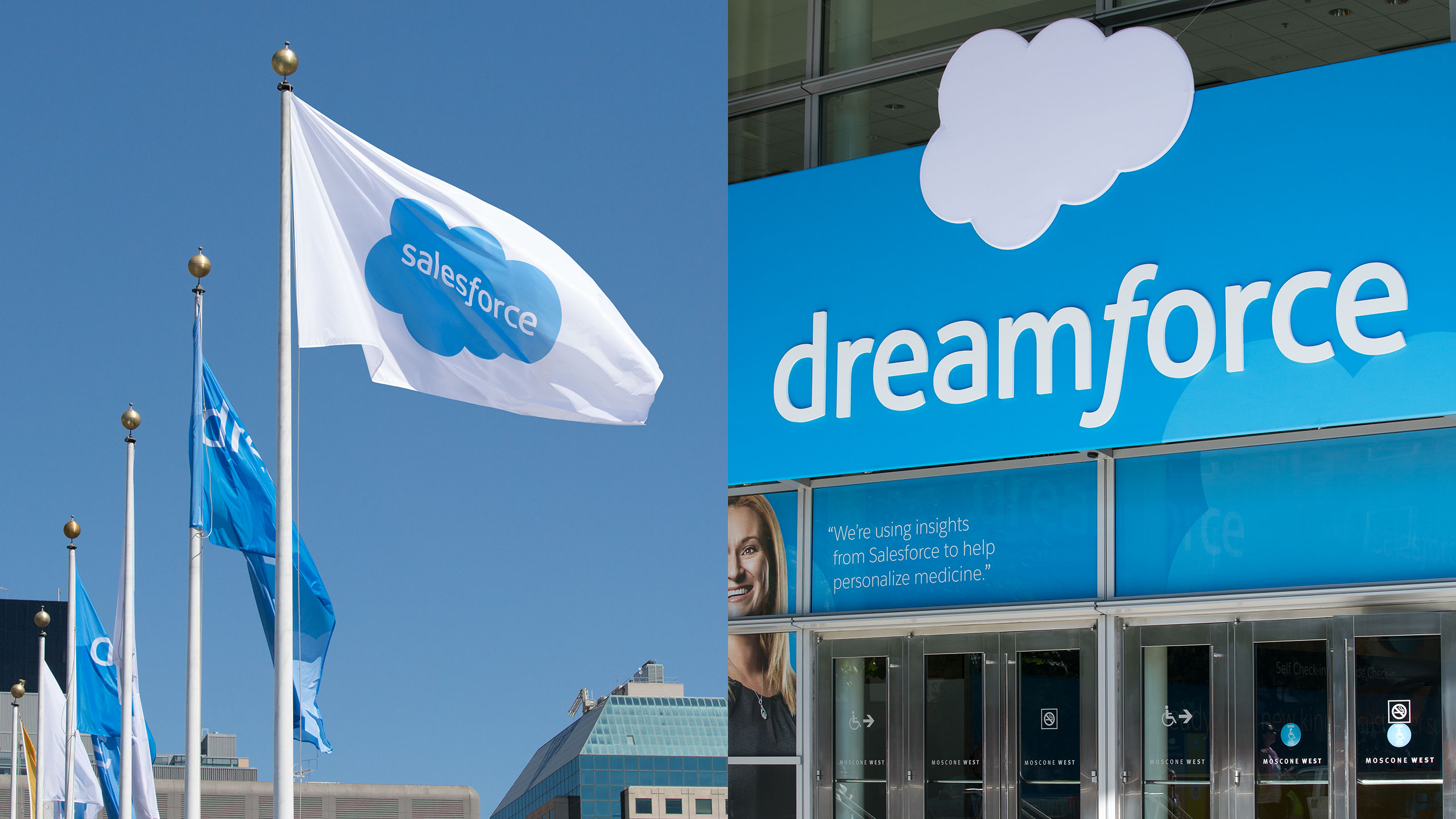
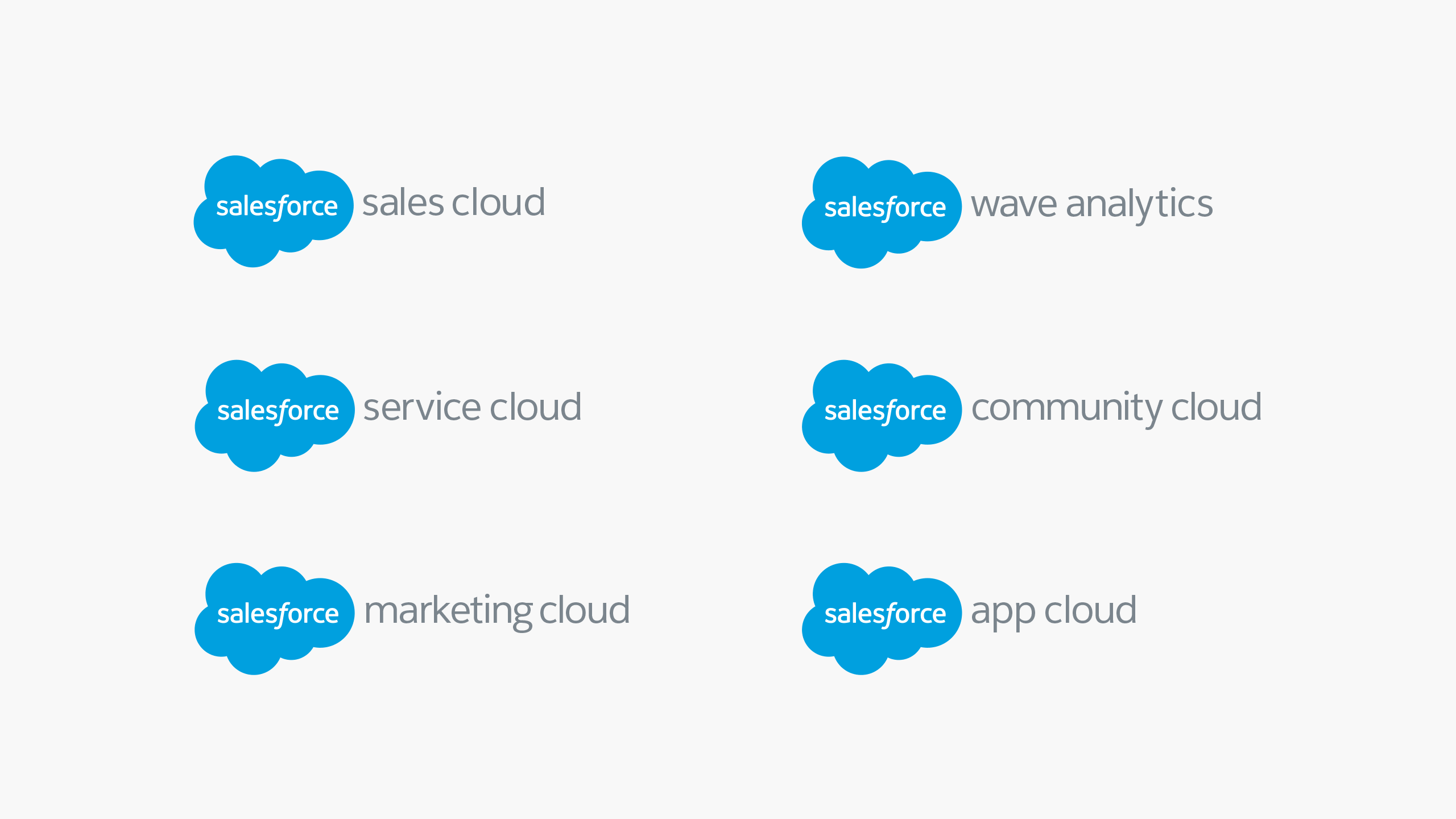
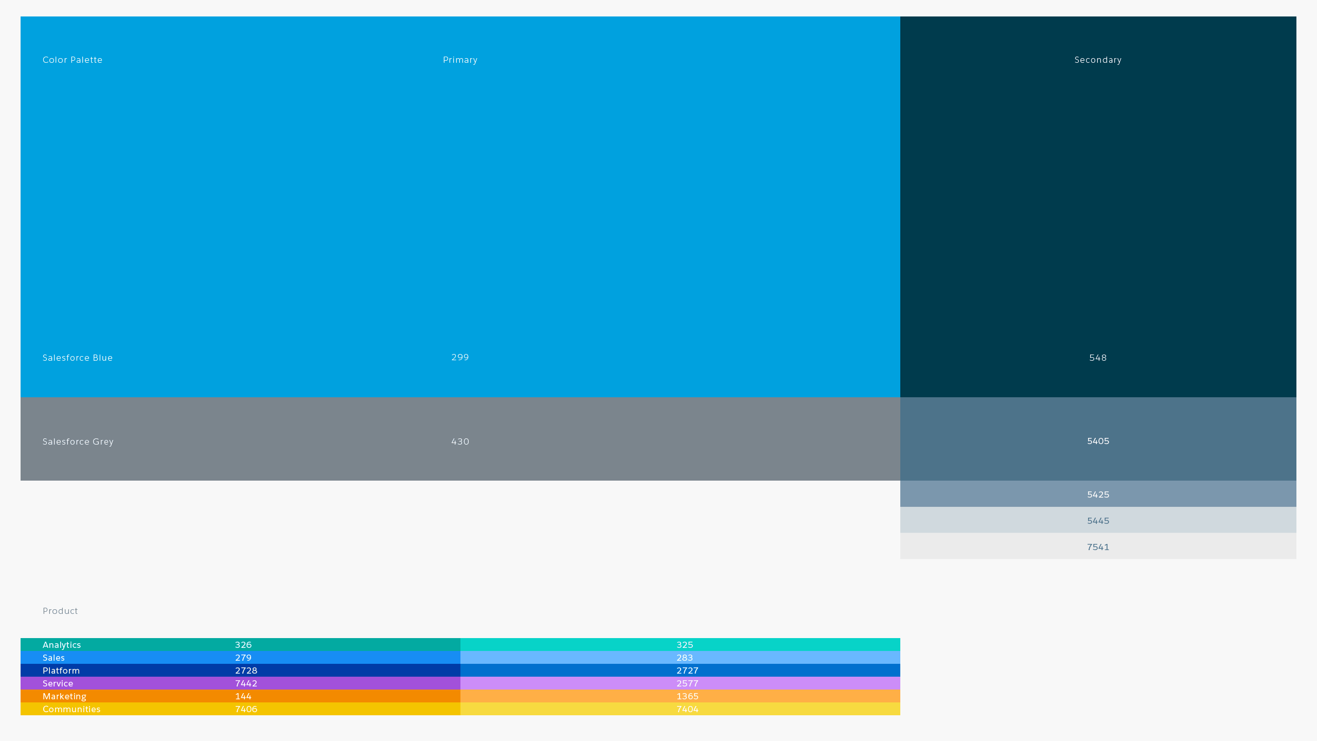
The updated identity system incorporates the cloud shape and stylized “f” into a modernized word mark with a flattened graphic form. Salesforce blue was refreshed with a friendlier hue and supporting cast of accent colors.
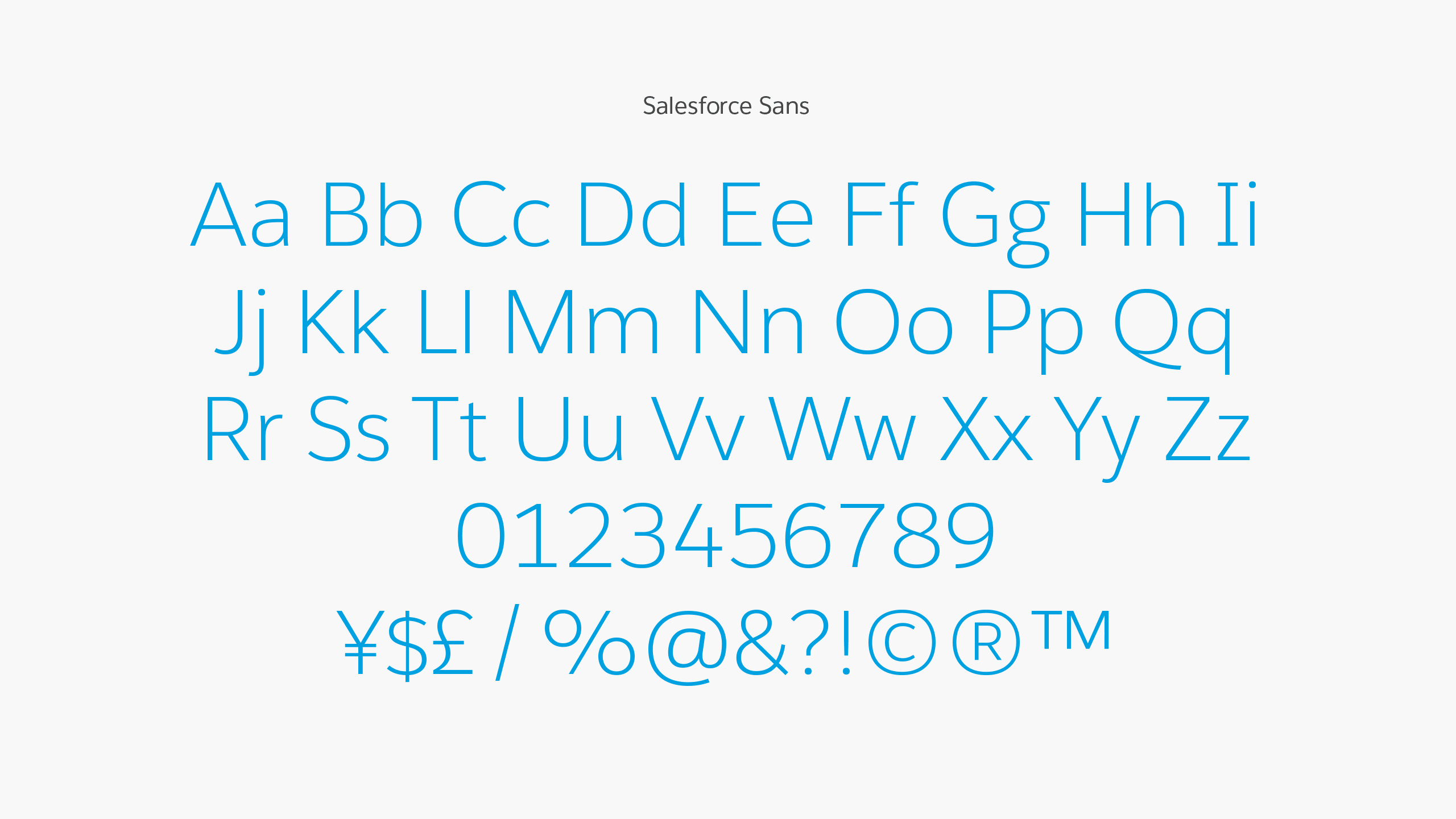
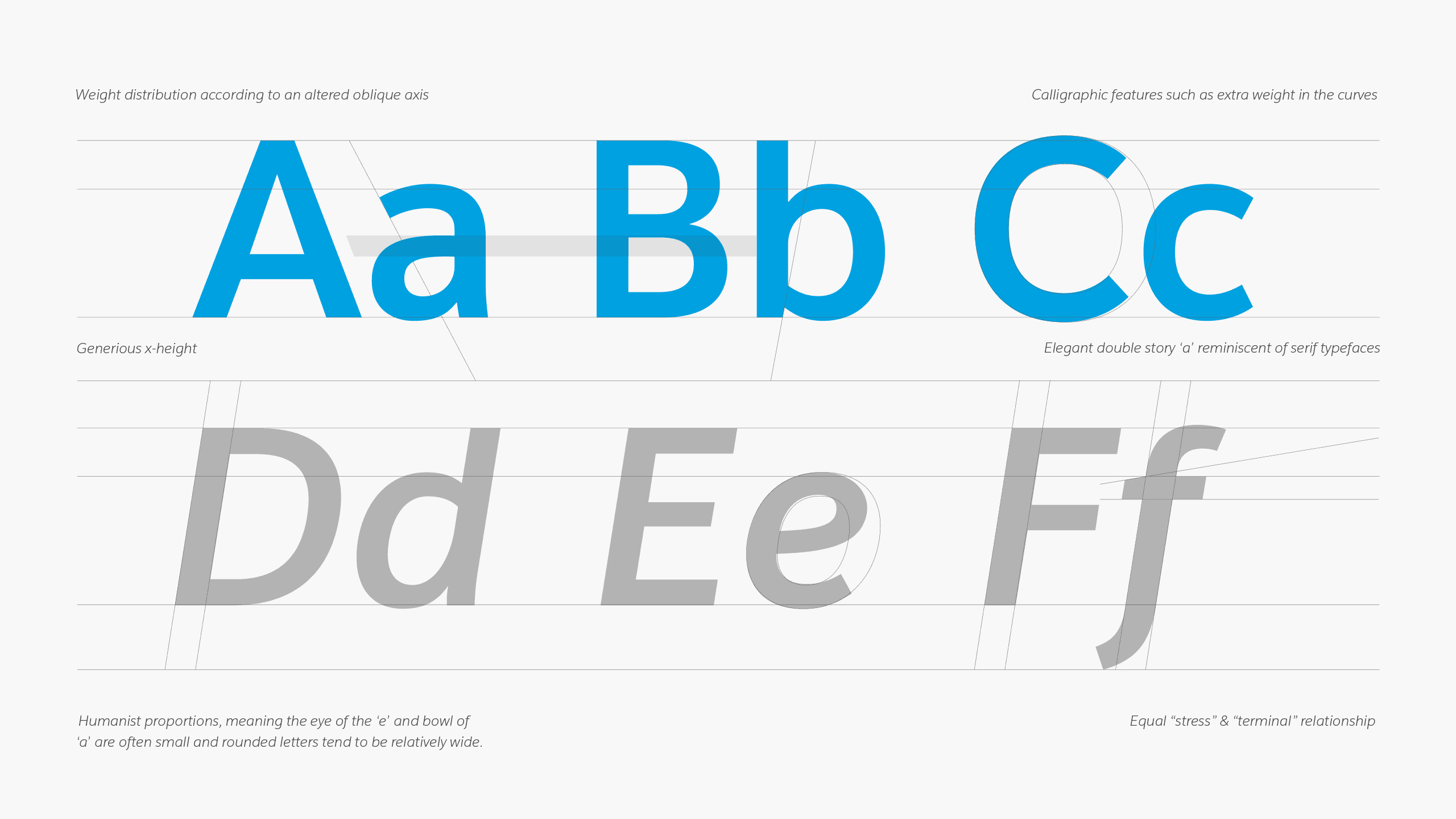
Salesforce Sans was influenced by the new Salesforce wordmark. The humanist typeface possesses rounded, flowing qualities with a generous x-height to scale across print and digital applications.

The identity system was deployed to millions globally through Salesforce’s apps, website and marketing channels.